|
Brainy's
Share Market Toolbox |
You
are here: Share Market
Toolbox
> ASX Investor Update
> ASX
Investor Update December 2013 - more Info
Related links: Summary list of other ASX articles; about Share Market; Robert's Philosophy; Share Market GEMs; Share-Market-Ready;Funda-Technical Analysis; Sensible Investing; Contrarian Investing Redefined; |
|||||||||||||
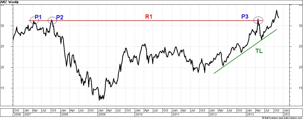
The December 2013 ASX Investor Update newsletterFor the published text of the December 2013 article that Robert authored, and the initial price charts, see the ASX article and the full edition of the December 2013 newsletter. Below is more information, and larger versions of the charts, and a few extra charts for even more information (click on the image for a larger version). Note that the text of these published articles is actually prepared about 2 weeks before it goes to press - due to the long lead time for preparation, editing and internal ASX approvals. So some of the material might seem a little dated.What? Sell the banks?With the share prices of the big banks having run fairly hard in 2013, and many investors chasing yield, might it soon be time to sell the banks? Should we have sold already? Or should we continue to hold them? How will we know when it is best to sell?Investor psychology and emotionsFirstly, it is worth having a quick chat about investor sentiment and psychology to help lay a foundation understanding for the information in this article.People participate in the stock markets of the world for a variety of reasons. But regardless of the reason, the opinions and emotions of all the active market participants are summarised in the price charts. When a company's share price rockets upward, or dives downward, it is because enough of the market participants have a strong enough view of the stock, or of the market generally, to cause the share price to move. Prices of financial instruments (such as shares, commodities, currencies, etc.) move up and down based on people's personal opinions, or perceptions of value, perhaps using fundamental analysis, or based on an expert valuation (that is, someone else's opinion). Also because of the underlying basic emotions of fear, greed and hope. See more information about investor emotion and psychology. ANZ revisits past highsAt the right-hand end of the weekly price chart below of ANZ (Chart 1), we can see the green sloping trend line TL sitting under the rising share price since a small double bottom pattern in late 2011. But look back six years to the start of this chart in 2007, where ANZ twice tried to move above about $31 as the market peaked in late 2007.Chart
1 - ANZ bank 2007-2013 (weekly line chart).
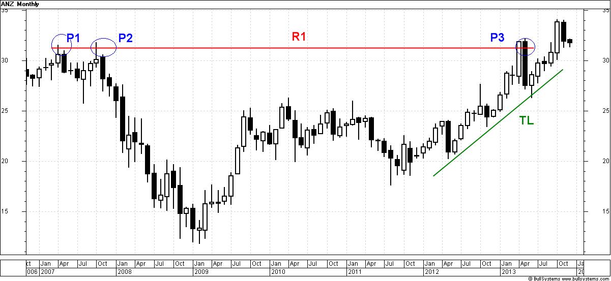
(click on the chart for a larger image) Remember that the weekly line chart above shows the close price for the end of each calendar week, and it cannot show the range in price during the week. However, a candlestick chart can show the range in price. See the monthly candlestick chart below (Chart 2) for the details. A weekly candle chart over this time period would squash the candles up too much; but the monthly chart below readily shows the entire range in price in each period (that's what the candlestick chart is good for). Compare the chart below to Chart 1 above - note how much more information is in the candle chart. Chart
2 - ANZ bank 2007-2013 (monthly
candlestick chart).
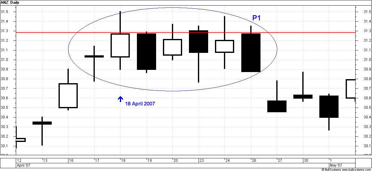
(click on the chart for a larger image) ANZ shares actually touched an intraday high of $31.50 on 18 April 2007 (peak P1 on the charts above), but closed lower at $31.27 there must have been enough sellers at that price level to overpower the buyers and pull the price down. The intraday high is not shown on the weekly line chart (Chart 1 above), but is visible on the monthly candlestick chart (Chart 2 above), and even more apparent on the daily candle chart below (Chart 3). [Remember that with a white candle, the bottom of the candle body is the open price for the period, and the top of the body of the candle is the close price for the period. See more information about reading candlesick charts.] Chart
3 - ANZ bank April 2007 (daily
candlestick
chart).
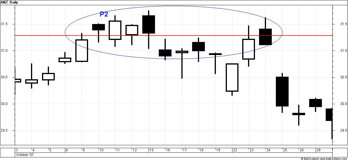
(click on the chart for a larger image) ANZ shares touched $31.50 in April 2007, and then again six months later (peak P2 - see Chart 4 below), and after several attempts to move higher over a three week period (not apparent on the bigger time frame charts above) the sellers dominated and the price fell into the GFC a fall of more than $19 (62 percent) over 70 weeks bottoming out in early 2009. (This fall is apparent in Chart 1 and Chart 2 above). Who said blue chip stocks are safe? [In fact, blue chip stocks can disappoint far too often. See more details about the disappointing blue chips.] Chart
4 - ANZ bank October 2007 (daily
candlestick chart).
(click on the chart for a larger image) Interestingly, when ANZ's share price again reached the pre-GFC peaks at peak P3 (in Charts 1 and 2) on 30 April 2013 there must have been a lot of stock holders who had bought it in 2007, and who simply wanted to recover their capital. An excess of sellers caused the price to fall strongly during May 2013. The horizontal red line R1 indicates this resistance price level. See more explanations about price support and resistance levels. Was the ANZ sell-off of 2008 a once-off? Well, the ANZ share price has fallen by at least 20 percent on at least six occasions since 1986, and in fact five of these saw a fall of more than 35 percent. Which prompts another question: is this normal behaviour?. Bear markets and corrections are commonYou might not believe it, but on the Australian share market a bear market or correction comes around at least once every four years. Remember that a bear market is a fall of more than 20 percent, while a correction is a fall of between 10 and 20 percent. And, as if this isn't enough, the market index eventually rises back to the pre-sell off level and sustains new highs after as much as 3 years (on average).The important lesson here is that if we can find a way to avoid the serious downward moves, then we can in fact lock in our profits and protect our capital. Now many finance industry professionals claim that we can't time the market; but tens of thousands of investors and traders who look after their own investing can easily prove them wrong. See more information about bear markets and corrections. ANZ price support levelsLet's take the weekly price chart of ANZ above, and zoom in to look at the daily chart version over the shorter period of October 2006 to February 2008 (the left hand end of the above chart). In this chart notice that there are many price levels where the buying and selling has stopped rising, or falling, and turned in the other direction. A couple of these are indicated with the horizontal lines S1 and S2 (indicating price support) and line R2 (indicating price resistance).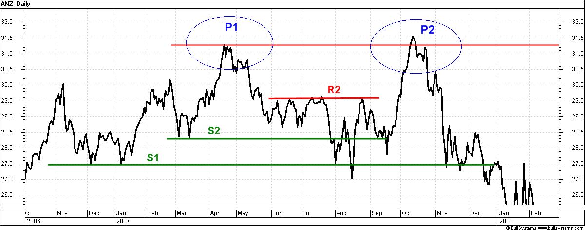 Chart 5 - ANZ bank October 2006 to January
2008 (daily
line chart) Remember that a daily price chart shows the close price for the end of each day. The line chart does not show any wild intraday swings. However, the candlestick charts shown above do show the large ranges in each period. The price behaviour at these price levels indicates a lot of opposing opinions about fair value (or intrinsic value) for the share price. A support level comes about on the price chart because when the price is falling and the sellers offer their shares for sale at lower prices, buyers step in and snap them up. As more and more buyers join the bidding war, they end up outweighing the sellers and the price moves higher again. Subsequent attempts by sellers to sell shares at a similar level will continue to see buyers step in and buy the shares until there are no more buyers at that price level. When there are no more buyers, then the share price falls below the support line, and at the lower prices more sellers join in the selling and cause the share price to fall further and often faster. And this all happens because the market participants have different opinions about what the shares are really worth. The chartist, however, doesn't care about the opinions, as he just reads the chart and goes with the moves. After the peak P2 on this chart, the ANZ share price continued to form a series of lower peaks and lower troughs as it sailed down past support level S1 and off the bottom of this chart, and plumbed the depths of the GFC for more than a year. In hindsight, the price level S1 could have been a Stop Loss level. That is, in late 2007, we could have adopted the view that if the share price was to fall lower than S1, then it would be likely the sellers would continue to dominate. [Dow theory says that once a trend is confirmed, it is likely to continue - see more information about Dow Theory.] History is fine, but what about now?We know that a number of Australian large cap stocks have been paying high dividends lately. This might be because of company cash stockpiles as the economy improves, or perhaps in response to investors who are actively seeking higher yields. Whatever the reason, it probably won't last forever.One day, any high-yielding stock might wind back the high dividend, and one result could be investors selling the stock to chase a high yield elsewhere. If this happens, the sell-off might be slight and short-term, or it might be a stampede and long-lasting no one can say for sure until it happens. So, in case the sell-off might be significant, it seems sensible that we should decide in advance that if a company's share price falls to a certain point, then we will sell to lock in profits and protect our capital from possible further falls. Many successful investors and traders actually do this utilising the idea of a stop loss, or a more serious exit strategy to sell on price weakness before the fall. But if we want to do this, we ought to make our strategy decision before we need to action it, and not afterwards. Then we simply implement the strategy without emotion. Stop loss using price supportThe method of using price troughs as support levels and possible stop loss positions was discussed in the May 2013 ASX Investor Update article Bank stocks buy or sell?. Another good and current example is the accompanying daily price chart of National Australia Bank (NAB) from March to November 2013.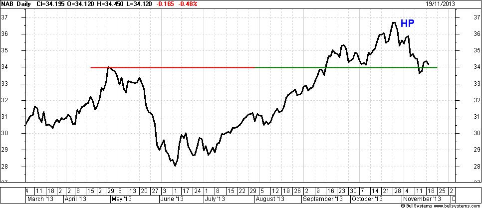 Chart 6 - National Australia Bank - March to
November
2013 (daily
line chart) This chart shows a horizontal red line of price resistance at $34 in late April 2013 which stopped the rising price. After four more months, and a price fall of 17 percent followed by a nice rising trend, the share price retested that past resistance level in September, then rose above it, and came back to sit on it in October, before rising to a higher peak HP in late October. At this point, we can see that the $34 support level would have been a good level to place a Stop Loss or just below $34 actually. After the peak HP, the share price trended back down to the $34 level and below. At the time of writing, the downtrend is still in place. Remember, once a trend is under way, it is likely to continue. It is possible that the share price could turn upwards and start a new rising trend; but there is no way to tell when this might happen. Until it does, the downtrend is confirmed. Weinstein's weekly chart and the MARegular reader's of these ASX Investor Update articles will have already read about Stan Weinstein in earlier editions, and seen references to his book Secrets for Profiting in Bull and Bear Markets.In his book, Weinstein advocates using weekly price charts, and a 30-week Moving Average (MA). It is healthy to see the MA rising and the share price above the MA. Conversely, if the price is below the MA and the MA is falling, then that's bad and it's a possible condition to sell. This is explained in the accompanying weekly price chart example of Commonwealth Bank (CBA).  Chart 7 - Commonwealth Bank - 2007-
2013 (weekly
line chart) This chart covers the 6 year period from October 2007 until November 2013. The price level R1 (a resistance level at about $61) was at the market top in late 2007, where CBA closed at $61.65. Over the following 15 months CBA fell and bottomed at $24.07 a fall of $37.58 (61 percent). During the fall in 2008, the CBA share price range-traded under resistance line R2, within a $9 band between about $37 and $46. After the bottom in 2008, it took CBA four years until 2012 to make new sustained highs. Eventually CBA broke clear above the resistance R1 and continued to trend higher. Along the way it retraced to a trough at the price support level S2 at about $65. This ought to be a strong support level going forward, and could be a stop loss level if the price falls below this, it is likely to continue lower. A higher stop loss could now be set at the next trough at about $71. But also notice the blue curved line on this chart the 30 week Simple Moving Average (SMA). Since it turned up in early 2012, the price has mostly stayed above it. In Weinstein's terms this is bullish. One possible exit signal to sell CBA would be if the share price falls below this SMA, and the SMA turns down. ConclusionThe charts can tell us a lot about the underlying sentiment and opinions of the market participants. If the general market is bearish on a particular stock, it can show up in the charts. A sensible exit strategy, and use of a sound stop loss approach, can capture profits and protect capital. The price charts can reveal a lot of very useful information.More Information?Want to understand more about how to interpret the price charts? See the details above at right... |
To
print this web page - in your browser select the printing
option "Shrink to fit". View larger versions of the charts below by clicking on the chart. More informationTo understand more about how to interpret the underlying mood and sentiment using the price charts:
Share
Market Terminology
See Brainy's eBook Articles, and the Master Index list for details. Or, search the eBook Articles. Robert Brain provides support to both new and experienced traders and investors. Who
is Robert Brain? 
The toolbox is an arsenal of weapons to help you tackle the share market. See a list of contents on the Toolbox Gateway page. The Share Market - more information about the market and investing and trading.  And whatever you do,
beware of the sharks in the ocean! |
||||||||||||
|
The information presented herein
represents the
opinions of the web page content owner, and ©
Copyright 2013-2015, R.B.Brain -
Consulting (ABN: 52 791 744 975).
|
|||||||||||||


