|
Brainy's
Share Market Toolbox |
You
are here: Share Market
Toolbox
> ASX Investor Update
> ASX
Investor Update May 2014 (the unpublished article)
Related links: Summary list of other ASX articles; about Share Market; Robert's Philosophy; Share Market GEMs; Share-Market-Ready;Funda-Technical Analysis; Sensible Investing; Contrarian Investing Redefined; |
||||||||||||||||||||||||||||
The May 2014 ASX Investor Update newsletterRobert was invited to write another submission for the May 2014 edition of the ASX Investor Update newsletter featuring an article on the big four banks. However, the submitted article was pulled at the last minute, apparently as it included some material that the ASX could not agree to (regarding dividend stripping). We can't understand that; but the full article is submitted below. So, you be the judge. The material was researched and written, and the price charts prepared, so let's not waste it - it's here for you to see. (The price charts were captured on 24 April 2014). The big banksReporting season, bank dividends and yield watch out for the minefield. In this article we cover some very important issues around investing in the banks, and the dividend stripping strategy to help protect capital and lock in profits. Twice yearly reporting seasonShare prices can move sharply during the reporting season, so it is useful to be aware of the details. Companies are required to lodge financial reports with the corporate regulator (ASIC) within certain time periods, and publicly listed companies must also lodge reports to the Australian Securities Exchange (ASX) within time limits. Most of the publicly listed companies on the Australian stock market have their six-monthly financial reporting period ending on 31 December and 30 June (their so-called balance dates), and according to the listing requirements for the Australian market, these companies must also announce their half-year results within two months by the end of February and August respectively. However, a number of our listed companies, including our major banks, have a different financial reporting date, and hence the deadline for both the results reporting and dividends is different. [To find these key dates, simply Google the term financial calendar and include the relevant stock code.] For the record, the following dates apply to the current reporting season.
Table
Banks results and ex-dividend dates Dividend stripping - is it worth it? does it work?A
number of variations
of the popular dividend stripping strategy are in widespread
use; but
there are some critical tips that can really help investors
(without
recommending that investors follow such a strategy).
Firstly, many investors blindly follow the standard suggestions
regarding the 45-day rule, in order to qualify for franking
credits.
But it is important to do the sums on historic share
prices and dividend details to confirm that this approach is
financially sound in today's market. It is possible that
holding the
shares for a shorter period might result in much better
short term
capital growth, even at the expense of losing the franking
credits.
[So, ignoring the dividend stripping strategy might be the
best way to
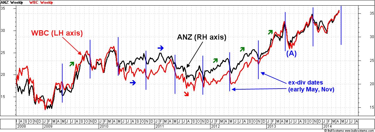
go, and simply strive to maximise capital growth.] Also, we should be wary of any advice that suggests that if our stock suffers a capital loss, it can be written off against a capital gain. Whilst this may be true, is it really the most profitable approach? After all, whose money is it? Many investors blindly assume that a stock's share price will fall on the ex-dividend date by about the amount of the dividend. In practise this might happen, and it might not. Many stocks show a gap lower at the open on the ex-dividend date which can be easily seen on a candlestick chart, but not on the more common line chart. And some stocks experience selling in the days before the ex-dividend date, so as to beat the crowd and lock in better profits. Watch the capital it is yours!Since late 2009, the Australian share market has been a different animal compared to the previous few years. The market saw a fantastic bull run from 2003 to late 2007, with the GFC crash following in 2008 until the market lows of March 2009, followed by a strong rally until late 2009. Since then, however, the market has moved in wide sideways ranges, and during this time the old conventional investing rules have been severely tested. Including the age-old buy and hold paradigm, and the rules for investing in the big banks. (Remember that blue chip stocks can disappoint.) Lately, many investors have been chasing yield, and in recent weeks (April 2014) three of the four big banks have been trading at, or close to, all-time highs (CBA is close to it's all-time highs of November 2013). National Australia Bank is the exception which (at about $36) is trading about 20 percent below it's peak of almost $45 in November 2007. Does that mean it is overdue for a strong rally? At more than six years overdue, who knows if and when that might happen. Stock gyrations at dividend timeThe price charts of both ANZ and Westpac are very telling. Study the accompanying weekly chart which shows both these banks since before the market lows of early 2009. Note that the share prices of both banks are very closely correlated they track each other closely most of the time. [A long-term chart like this is useful because the market is like an elephant.] Chart
1 - ANZ and Westpac (weekly
line chart, 2009-2014).
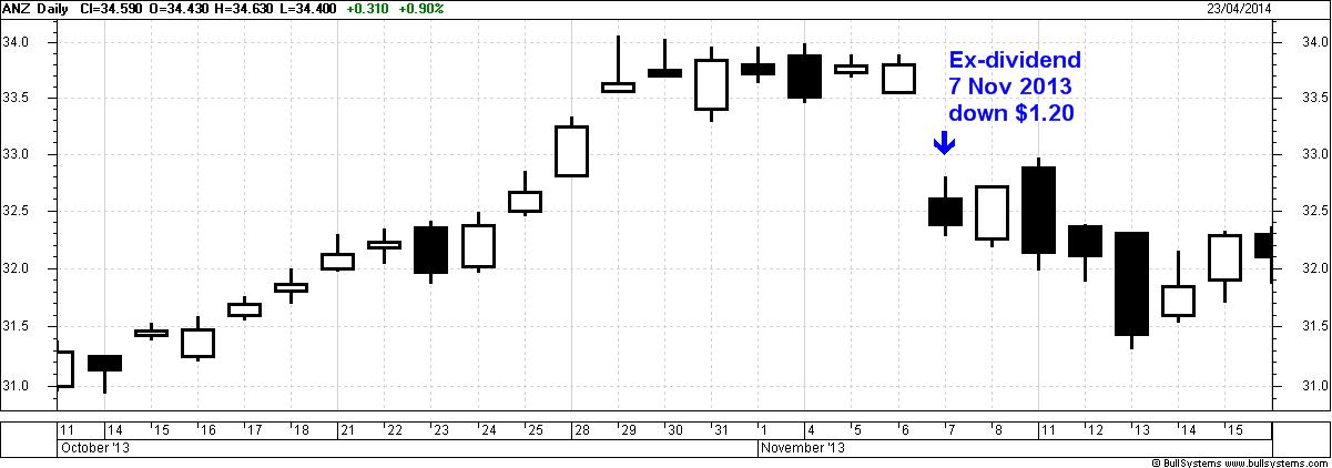
(click on the chart for a larger image) On this chart, note the short vertical lines placed every six months at the ex-dividend dates. These two banks tend to go ex-dividend at about the same time (early in the months of May and November). There are two key things to observe on this chart. Firstly, the share price does often fall at about the ex-dividend date not necessarily on the day, nor soon after, and sometimes before. Also note that in between the ex-dividend dates there have been multi-month periods of strong rally (mid-2009, early 2012, late 2012, and early 2013 indicated with the small upwards arrows). But there have also been some periods where the share price has traded mostly sideways, or even moved lower. Also note that both banks fell about 18 percent in May 2013 indicated at (A) on the chart (ANZ fell 17 percent and WBC fell 19 percent, measured from highest close to lowest close on the daily chart). And six months later in November, these two banks fell about 13 percent. At a glance, it seems that buying a bank stock weeks before the ex-dividend date, and selling on the ex-dividend date, might give us a dividend with franking credits; but the variation in capital value is significant. We might ask ourselves if our capital appreciation has been optimal, or if we could have done better. [It might sound a little callous, but many investors simply accept that their shares can fluctuate wildly in value, and they believe that this is acceptable because they also believe that any alternative is too hard when in fact it doesn't have to be. Remember that the opinions and emotions of market participants are captured in the price charts.] Beware the ex-dividend date price dropMany investors might not realise exactly what happens on the day that a stock trades ex-dividend. The chart below is a daily candlestick chart -- each individual candle summarises the price action for each day and indicates the daily open, high, low and close prices (see more information about candles). Chart
2 - ANZ (daily
candlestick chart, October-November 2013).
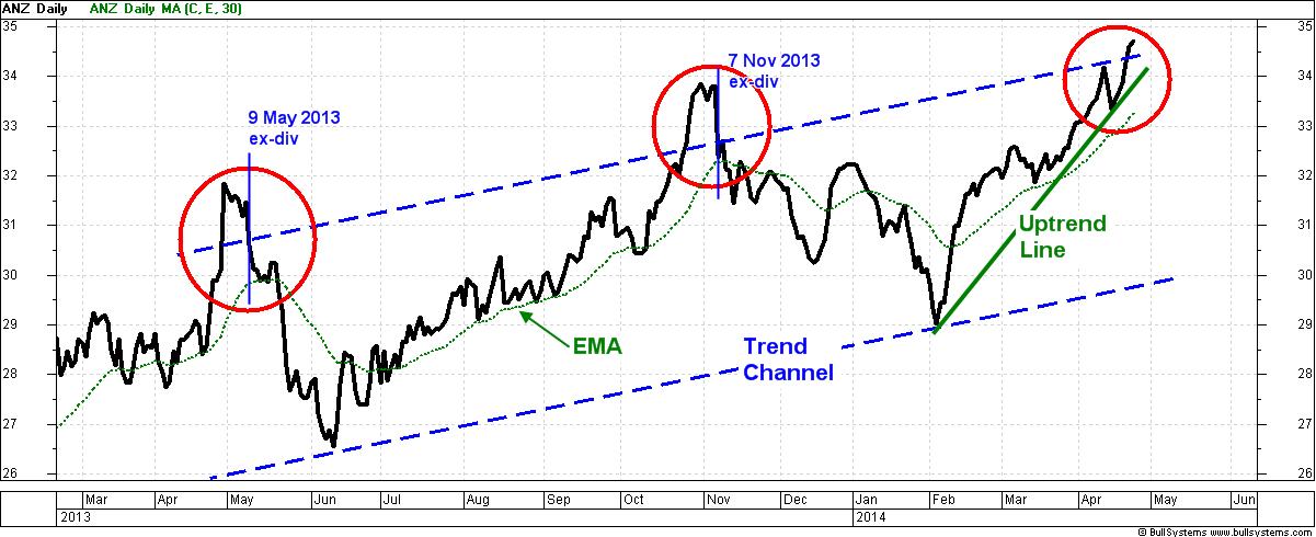
(click on the chart for a larger image) In this price chart note that ANZ's share price opened $1.20 lower on the latest ex‑dividend date last November, and closed the day an extra $0.22 lower (that's $1.42 lower than the previous daily close). And the gross dividend value was $1.30 (including $0.91 franked and $0.39 franking credit). It's also worth noting that the first 14 candles in this chart show that the ANZ share price rallied strongly in at least the three weeks before going ex-dividend, and then plateaued for the last seven days with the share price stuck in a trading range (mostly between about $33.30 and $34). It's interesting to ponder whether we might have done better to sell after two or three days of this plateauing price before the fall on the ex-dividend date, and forego the dividend. Some three months later ANZ ended up 14 percent lower than these highs (that's $4.82 lower). It might have been possible to protect the capital, and buy back in at lower prices? The trend is your friendIt is very useful to remember this adage. In technical analysis terms, a share price uptrend is simply a series of higher peaks and higher troughs, and once in place, it is likely to continue. A daily price chart is very useful for studying trends, and using a Moving Average chart indicator can also help significantly. The price chart below is a daily line chart of ANZ showing the closing price each trading day. This chart starts in late February 2013, and runs until late April 2014. Chart
3 - ANZ bank daily
detail over the last 12 months.
(click on the chart for a larger image) The Trend Channel (the two dashed parallel lines running across most of the chart) comprises two parallel lines which contain most of the price action. Note that the share price raced above this channel in the days before the ex-dividend dates, then fell sharply back into the channel. Not only did the share price fall back into the channel, but it continued to the bottom line of the channel. [Note: there is no guarantee that the same thing will happen in the future; but we won't be surprised if it does.] The 30-day Exponential Moving Average (EMA) is the dotted green curve across the chart. The slope of the EMA curve gives us some hints regarding the share price trend. At any point on this curve where the curve is moving higher, it tells us that the average share price over the previous 30 days is tending to be higher and higher. This is a clue regarding price trend, and the steeper the curve the faster the trend. When this curve flattens and turns down it indicates that the average of the recent prices is heading lower. We have talked in earlier articles about Stan Weinstein's approach (30-week MA on weekly charts and stage analysis), and the same principles apply here. Note that for most of the time on this chart, where the price is above the rising EMA it is bullish. Watch out when the EMA flattens, and the share price is falling towards the EMA, or even crossing it. The Uptrend Line (the short straight upward-sloping green line near the right hand end of the chart) sits under most of the price action from the last significant low in early February. If the share price crosses below this line at any time, it will suggest that the strong rising trend is weakening, and that the price might fall. Some traders take this signal as a time to take profits, or even close a position. Stop Loss and Exit StrategiesMany people opt for a simple stop loss approach identify a recent dip on the chart and prepare to sell the stock if the price moves below this level. The above daily chart of ANZ shows a dip to $33.34 toward the end of the chart at 14th April 2014. This is a support level on the chart because there were enough buyers willing to buy the shares at this price. That is, the excess of buyers were convinced that the shares were worth more, and they outbid each other and over-powered the sellers to cause the share price to rise. Intraday trading activity, or even a daily close, below this level will suggest a change of opinion regarding fair value, and indicate possible price weakness and may forewarn of lower prices. The astute shorter term investors and traders look for other earlier signals to indicate price weakness, including the price dipping below an uptrend line, or the over-bought situation near the top of a trend channel or a tighter stop loss perhaps based on a candlestick pattern. In these situations some traders take profits, and prepare to sell quickly in order to protect capital. Whatever investment decisions we make this time around, it is useful to think about protecting our hard-earned capital with a wise risk management approach. And the technical analysis tools mentioned above certainly help. Opinions of market participants are locked in the chartsRemember that the opinions and emotions of market participants are captured in the price charts those price charts have stories to tell. It is useful to look for the turning points on the charts, and the speed with which the share price moved towards a past turning point, to give us clues about what might happen in future. If we know how to read the stories in the charts then we can capture profits and protect our capital. Sell in May and go away?Oh! The other thing to contemplate at this time of year is that age-old Wall Street adage that has held true on the Aussie market in each of the four years since 2010. Might there be another sell-off this year at some time through May-June? Disclaimer & DisclosureThis material is for general education only. It does not contain any advice. The mention of any third party company, web site, etc., is NOT an endorsement. It is simply a reference for further research and education. The author is a short term nimble investor who quickly sells stocks that exhibit price weakness, and does not hold any of the stocks mentioned herein. More Information?Want to understand more about how to interpret the price charts? See the details above at right... |
To
print this web page - in your browser select the printing
option "Shrink to fit". View larger versions of the charts below by clicking on the chart. More informationTo understand more about how to interpret the underlying mood and sentiment using the price charts:
Share
Market Terminology
See Brainy's eBook Articles, and the Master Index list for details. Or, search the eBook Articles. Robert Brain provides support to both new and experienced traders and investors. Who
is Robert Brain? 
The toolbox is an arsenal of weapons to help you tackle the share market. See a list of contents on the Toolbox Gateway page. The Share Market - more information about the market and investing and trading.  And whatever you do,
beware of the sharks in the ocean! |
|||||||||||||||||||||||||||
|
The information presented herein
represents the
opinions of the web page content owner, and ©
Copyright 2014, R.B.Brain -
Consulting (ABN: 52 791 744 975).
|
||||||||||||||||||||||||||||


