|
Brainy's
Share Market Toolbox |
You
are here: Share Market
Toolbox
> ASX Investor Update
> ASX
Investor Update October 2015 - more Info
Related links: Summary list of other ASX articles; About the Share Market; Robert's Philosophy; Share Market GEMs; Share-Market-Ready;Funda-Technical Analysis; Sensible Investing; Contrarian Investing Redefined; |
||||||||||||||||
The October 2015 ASX Investor Update newsletterFor the full published text of the October 2015 article that Robert authored, and the published price charts, see the ASX article here... and the full edition of the October 2015 newsletter. Below is some more information, and larger versions of the price charts (click on the images for a larger version). For the full text of the online article, do refer to the ASX.com.au web site.Resource stocksIs now the right time to buy resource stocks? Is the mining and resources slump coming to an end? Are there useful clues in the long term commodity price cycles? Many investors tend to look for an investment that is likely to out perform in the long term, while many other investors look for out-performance in the near term. I say the near term because we have seen in recent years that we can no longer achieve the best portfolio performance using a long term buy-and-hold strategy. There needs to be some amount of portfolio performance monitoring and fine tuning at least from year to year, and this cant be done with the set-and-forget buy-and-hold approach. Do refer to the online article at ASX.com.au for the full version. A
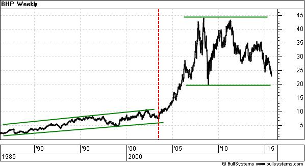
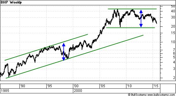
long-term price chart that covers a wide range in share price is
often
best viewed using a logarithmic price scale on the vertical
axis. Note
the two price charts below. They are both weekly charts of BHP
Billiton
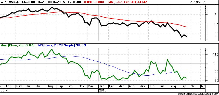
over almost 30 years from 1986 until mid-September 2015. Price cycle duration?For comment about the price cycle duration, refer to the online article at ASX.com.au.When to buy resources stocksIn the next price chart below, note that Woodsides share price (thick black line in upper half) peaked in August 2014, then began a sequence of lower peaks and lower troughs (a downtrend) with a lengthy pause for the first few months of 2015 while it ranged above $34 from February to June. It clearly fell below this level in August 2015, indicating the majority of market participants believed it was now worth less than $34. (The $34 price level was a support level, and then became a potential resistance level.) Until this downtrend is confirmed to have finished, there is a downtrend in place and we dont like trying to catch falling knives.
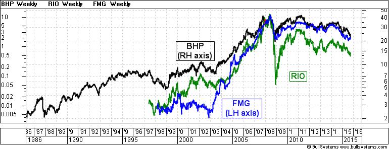
The red curve on the same chart (above) is the 30-week Exponential Moving Average (EMA). Stan Weinstein (who wrote the best selling book Secrets for Profiting in Bull and Bear Markets) advised that a falling share price below its falling 30-week EMA is very bearish (read more about Stan Weinstein and his approach using the 30 week Moving Average). The bottom half orefer to the online article at ASX.com.au for the full version.f the chart shows the Momentum chart indicator (the squiggly green line) with its own Moving Average curve in blue. With the Momentum recently revisiting past lows, this is also bearish. Stock pickingIf looking at some possible investment candidates and wondering which to choose, we could compare them as follows. If looking at our large resources stocks, BHP, Rio Tinto and Fortescue, we could plot their share prices on the one chart as in the accompanying diagram.
In this weekly chart we can see the strong moves in share price for both Rio and Fortescue, which are smoothed out somewhat by using the log scale on the price axis. The linear scale would show a strong price spike for Fortescue in mid-2008. (This chart shows corrected data for any stock splits and consolidations). We can see that BHP has had the less volatile share price, which might better suit some investors. But how have they actually performed in comparison to each other? ***
The following text and chart was not published in the Investor
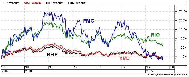
Update, The next price chart (shown below) is the comparative percentage performance of these three stocks, and their sector index the S&P/ASX 200 Materials index (XMJ). The chart is a weekly chart and indicates the percentage change in share price of each stock since the start of 2009 when the three stocks started their recovery from the falls of the GFC in 2007-2008.
This chart shows that BHP and the XMJ sector index have been closely correlated over that period. It also shows that Fortescues share price rallied about 250 percent over a two year period from its lows of 2009, then drifted away. In 2015 it has fallen back to about the same price as six years ago. This chart shows us the past performance of each stock in percentage terms, and compared to each other. It is a useful tool to help anticipate likely future performance. But these stocks are all down trending currently, and the share prices might fall a long way further before reaching a bottom. ConclusionA technical analysis of the price charts can be very useful to tell us where the share prices have come from, and in comparison to each other, and whether a price rise or fall is more likely in the short to medium term. More Information?Do refer to the online article at ASX.com.au for the full version of this article. Want to understand more about how to interpret the price charts? See the details in the right-hand column above... |
To
print this web page - in your browser select the printing
option "Shrink to fit". View larger versions of the charts below by clicking on the chart. More informationTo understand more about how to interpret the underlying mood and sentiment using the price charts:
Share
Market Terminology
See Brainy's eBook Articles, and the Master Index list for details. Or, search the eBook Articles. Robert Brain provides support to both new and experienced traders and investors. Who
is Robert Brain? 
The toolbox is an arsenal of weapons to help you tackle the share market. See a list of contents on the Toolbox Gateway page. The Share Market - more information about the market and investing and trading.  And whatever you do,
beware of the sharks in the ocean! |
|||||||||||||||
|
The information presented herein
represents the
opinions of the web page content owner, and ©
Copyright 2015, R.B.Brain -
Consulting (ABN: 52 791 744 975).
|
||||||||||||||||


