|
Brainy's
Share Market Toolbox |
 |
ASX Investor Update
|
 |
Dow Theory and the current bull marketThe
March 2017 edition of the ASX Investor
Update
newsletter features an article Every chart tells a story - it pays to understand the stories in the price charts!Included
below is more information, and larger versions of the
charts |
| You
are here: Share Market
Toolbox
> ASX Investor Update
> ASX
Investor Update March 2017 - more information Related links: Summary list of other ASX articles; About the Share Market; Robert's Philosophy; Share Market GEMs; Share-Market-Ready; Funda-Technical Analysis; Sensible Investing; Contrarian Investing Redefined; |
The March 2017 ASX Investor Update newsletterRobert's contribution to the March 2017 ASX Investor Update newsletter included many more words than could be accommodated in the published version of the newsletter. The full article with additional comments and larger versions of the price charts is included here (Toolbox Members click on the images for a larger version).See the published article at the ASX website, and also see the full edition of this ASX newslettter. Bulls versus Bears: What Dow Theory tells usWhere the sharemarket is now and what may bring a change. According to Dow
Theory
there are reputed to be three stages to a bull market, so which
stage
are we currently in? And what might happen next? What is Dow Theory?Firstly,
the
term Dow Theory refers to a body of knowledge which underpins
key
aspects of contemporary technical analysis. It is not a
methodology for
100 percent guaranteed success in the markets; but it is
extremely useful
because the price charts of various financial instruments
summarise the
opinions of the market participants. Tenet #4 A trend remains in effect until a clear reversal
To help set some foundation understanding, lets skip the first
three
tenets of Dow Theory and talk briefly about share price trends
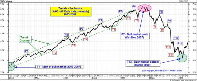
uptrends and downtrends. In technical analysis terms a trend is
defined
on the price chart as a sequence of higher peaks and higher
troughs for
a bull market period (an uptrend), and a sequence of lower peaks
and
lower troughs for a bear market period (a downtrend).
We also note there
are
lots more peaks and troughs on this chart, situated in between
the ones
that are labelled. These indicate the shorter term noise, and in
fact
can also be used to indicate a price trend in shorter time
frames. For
instance, between peak P2 and trough T3 there are several lower
peaks
and lower troughs which indicate a downtrend within this shorter
time
frame. Likewise between P4 and T5 (and also between other peaks
and
troughs). As
it happens, once a trend is in place and confirmed, it is likely
to
continue until it is confirmed to have finished. That means that
if a
downtrend is confirmed for a particular stock, then the
downtrend is
likely to continue, and we should not be entering a position
until the
downtrend is confirmed to have finished. Tenet #2 The market has three main movementsThis statement is
another of the six tenets of Dow Theory. The first of the three
main
movements to which this refers, is regarding the longer
term bull or
bear markets which can last from one year up to several years.
In the
first price chart above we can clearly see a bull market in the
first
three quarters of the chart which lasted for about five years,
and a
bear market in the last quarter of the chart which lasted for
about 16
months. So a bull market and a bear market are the first of the
three different types of main movements. They can also be
referred to
as a primary movement or primary uptrend (or downtrend). Tenet#3 Primary movements have three phasesNow that we have
looked
at our market in recent years, and identified some primary
market
movements (especially the uptrends), we can consider this next
tenet of
Dow Theory. The three phases within the primary movements are
considered to be: (a) accumulation phase, (b) public
participation
phase, and (c) excess phase.
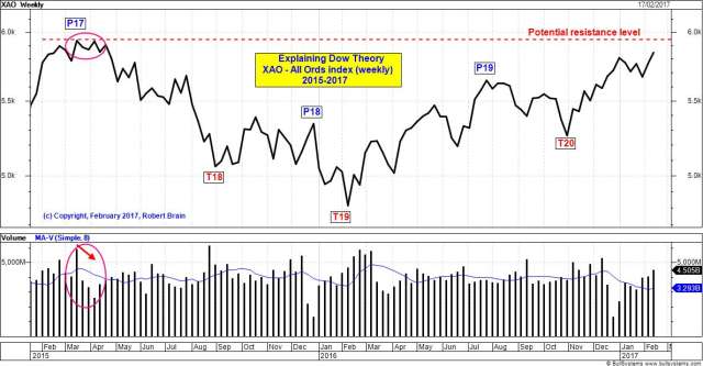
In this chart, note
what
happened the last time a bull market uptrend ended in April 2015
(the
left end of this chart, before falling 19 percent from P17 to
T19). The
index tried to move higher but could not push above about 5960.
For
several consecutive weeks in March and April the volumes
decreased week
on week (indicated in this chart). These declining volumes
indicated
less and less interest in purchasing stocks (ie. declining
demand), and
eventually resulted in the index commencing a fall in late
April. This
is what happens when the demand dries up, leaving a lot more
willing
sellers compared to the dwindling numbers of buyers. Also on this topic, note the rising index just after trough T19, and also note the volume bars. The index rallied higher in a clear uptrend to peak P19. The first few volume bars starting at T19 and immediately after T19 are all higher than the preceding volume bars. This indicates support for the higher prices (the higher value of the index - but remember that retail investors don't trade in the index, because they are trading in shares in companies that might make up the index, and it is the volume in these shares which is indicated here). Thats some of the theory, so now lets look at the practical aspects and consider the question: Where are we now? Where are we now? which bull market stage?Lets start by
looking
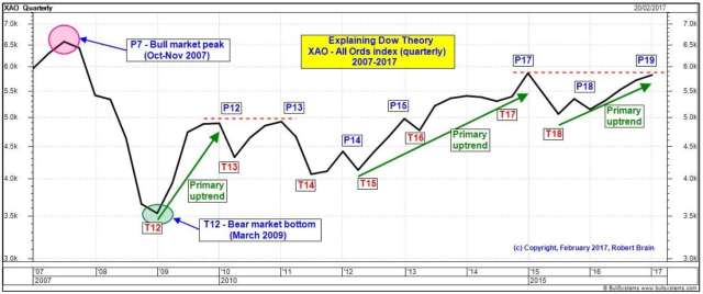
at the quarterly chart of the index below (a quarterly chart
shows the
index value at the end of each calendar quarter regardless of
what
happened during the quarter but a candlestick chart
will show the range in
price). We can easily spot the bear market bottom in March 2009
(T12).
This is followed by what might initially look like a sequence of
higher
peaks and troughs except that, technically, it is not (because
T14 is
lower than T13, and T18 is lower than T17), even though the
index was
low in March 2009, and is much higher towards the right end of
this
chart. Some people might suggest at a glance that we have an
uptrend on
this chart because the price is low near the left end of the
chart, and
it is higher at the right end.
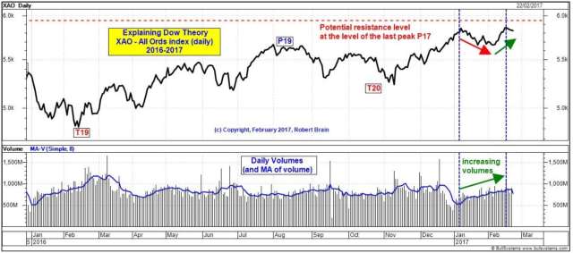
There are actually several periods on this chart that are primary (bull market) uptrends (from T12 to P12, and T15 to P17, and T18 to P19). Each of these have secondary reactions between them. So what is likely to unfold in the coming weeks? If we drill down and look at the weekly or daily chart for the same period, any conclusions should be clearer. So lets look at the following daily chart.
Firstly, notice at
the right end of the chart that
daily volumes increased through January 2017 and into February
while the
index fell by only 3 percent. This suggests an excess of sellers
(which is bearish).
More Information?Do refer to the online article at ASX.com.au for the published version of this article. Want to understand more about how to interpret the price charts? See the details in the right-hand column above... |
To
print this web page - in your browser select the printing
option "Shrink to fit". View larger versions of the charts below by clicking on the chart. More informationRead more about:
To understand more about how to interpret the underlying mood and sentiment using the price charts:
Share
Market Terminology
See Brainy's eBook Articles, and the Master Index list for details. Or, search the eBook Articles. Robert Brain provides support to both new and experienced traders and investors. Who
is Robert Brain? 
The toolbox is an arsenal of weapons to help you tackle the share market. See a list of contents on the Toolbox Gateway page. The Share Market - more information about the market and investing and trading.  And whatever you do,
beware of the sharks in the ocean! |


 Also
note one key
aspect of the above discussion. We started by looking at the big
picture a longer time period on a monthly chart (because