What can the candles tell us?
- Example
The candlestick chart can tell us
a lot about the price action in a
"period", as well as the health,
mood and
sentiment of
the market.
The sample candlestick chart at
right is a daily
chart of the XAO
index
(All Ordinaries)
in late October 1997 (a market
correction). Each daily candle
summarises the price action in
each day. (On a weekly chart, each
weekly candle summarises the price
action in a whole week. Likewise
for
monthly, quarterly, yearly, etc.).
Notice the four long black candles
on this sample chart indicating a
savagely falling market index
value, with a long lower tail on
the last candle (indicating a
rejection of lower prices). These
four black
candles represent a daily decrease
in the index by about: 2%, 2%, 3%
and 7% respectively - a total
decline of about 14% in just four
days.
These
candles show that sellers
dominated the market in an almost
panic-stricken manner.
This large fall is followed by a
tall white candle (a rare increase
of
6%), and mostly increasing index
values in the following few days.
The sequence of long black
candles, followed by a tall white
candle is
a candle bottom known as the Tower
Bottom.
One key give-away for
candle-watchers on this chart is
the very long
lower tail on the lowest black
candle, which suggests a
"rejection of
lower prices", and shows that
there were significant buyers in
the
market.
Knowing how to read these simple
candles can be so very useful in
gauging the mood and sentiment of
the market.
|
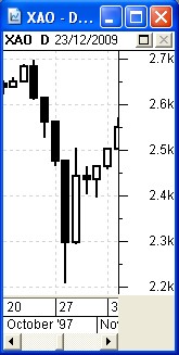
Sample candlestick chart
XAO
index
(All Ordinaries)
in late October 1997,
a market correction.
(see explanatory text at left)
|
|
What is this example
chart telling us?
In
the example above, the consecutive black
candles, with the last one
having a long lower tail, followed by a
tall white candle, indicates
what we call capitulation
- a concerted effort by desperate
investors to sell their stock at
whatever price just to protect against
further possible downside.
The
long lower tail on the last black candle
indicates that during the day,
even though there was heavy selling
(causing prices to fall further),
enough buyers stepped in to bid prices
higher so that the close for the
day was well above the low for the day.
(Remembering that this chart is
the market index, which is an aggregation
of 500 stocks, it does
reflect that is happening in a number of
the stocks within the index).
The
first white candle on this chart has a
very tiny lower tail, indicating
that buyers were dominating for most of
the session. The height of the
candle also indicates the buyers
dominating. The upper tail on this
candle and the next candle (a Spinning
Top) indicate a weight of
sellers still present; but the next three
white candles indicate the
buyers dominating again.
The index then went on to rise a total of
25 percent from the close on 28 October
over the next 6 months. |
Why is this
useful?
Knowing how to interpret basic candlestick
features and patterns can be
very useful in understanding the mood and
sentiment of the market.
Candles tell us a whole lot more about the
market than the simple line
chart can tell us.
They can help to identify likely turning
points in a stock or in the
market index.
Don't
forget that the price
charts summarise the opinions of
market participants.
|
A quick sample
The humble candlestick chart (like the
sample at right) shows us the
range in price in each "period".
This sample chart is a daily
chart of BHP showing the six candles for
each of six trading days in August. Each
candle shows us the range in
price in each day. The white candle on 20
August has a short lower tail
down to the Low price of the day, and a
very tiny upper tail (or wick)
reaching up to the High of the day.
- On a daily
price chart, the candle summarises the
price action for the day.
- In general terms, the candle
summarises the price action in one
"period".
- The "period" could be a
day on a
daily chart, or a week on a
weekly chart, or a month on a
monthly chart, etc., etc.
In the sample chart at right, the two
candles on 22nd and 25th are
shorter relative to the other
candles on the chart. This shows us a
shorter range in prices from the
high
to the low for each day, when compared to
the other days.
|
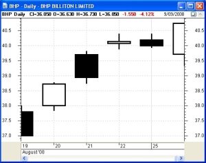
Sample Daily chart of BHP
in October 2008
Click on the image for a
larger version in a new window.
(see explanatory text at left)
|
Candlestick basics
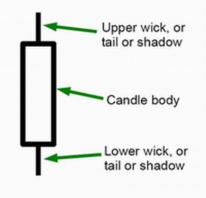
On share price charts a
candlestick (or
just simply a candle) can
comprise the following
elements:
- A Body:
- Which can be black or white
(or red or green).
- It can be very tall in size, or
it
can be short.
- In some cases, the candle body is
so short it
appears to have no body at all (eg.
what we call a Doji pattern).
- An upper wick
- also called a tail
or shadow.
- A lower wick
- also called a tail
or shadow.
It is possible to have only one tail on a
candle, or even no tails at
all.
|
 |
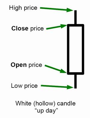
White
candle (or
green)
- The body of the candle is white (or
green).
- The bottom of the body indicates
the Open price for the "period".
- The top of the body indicates the
Close price for the "period".
- The top of the upper wick indicates
the High price for the "period".
- The bottom of the lower wick
indicates the Low price for the
"period".
Note: In case you didn't realise it, there
are four key price values in
every trading period which are captured
and stored, and available to be
viewed in price charts:
- Open price for the period - the
first traded price for the day.
- High price for the period - the
highest price paid during the period.
- Low price for the period - the
lowest price paid during the period.
- Close price for the period - the
last price paid at (or just before)
the close of the period.
|
 |
White and black - which is which?
We note the only difference between a
white candle and a black candle
is the position of the open price and
close price.
So, when comparing the white candle
(above) and the black candle
(below), how can we easily remember which
is which? |
How to remember white versus black?
The
colour black is often associated with doom
and gloom, so a black candle
indicates a period where the price fell
during the period, so the close
is lower than the open.
|
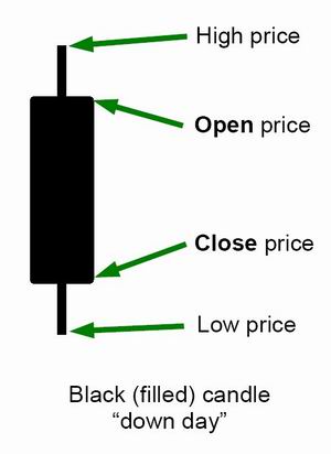
Black
candle (or red)
- The body of the candle is black (or
red).
- It is very similar to the white
candle except:
- The top of the body is the Open
price.
- The bottom of the body is the
Close price.
|
 |
Candle bodies, wicks, tails
When observing individual candles, it is
important to realise that the
candle body, and the tails, are all
optional. The key things to look
for include:
- Is there a body at all? If not, it
will be a Doji.
- Is there an upper wick?
- Is there a lower wick?
- If there is a wick, how long is it?
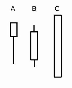
Note the three samples at right:
- A
long lower tail, suggests a rejection
of lower prices.
- A
fairly normal candle (to see in a
healthy rising trend) with an average
size body, and reasonably sized wicks.
- A
very tall bullish candle with no tails
at all (this specific candle
shape is called a Marubozu).
|
|
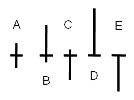
Doji candles
We mentioned Doji candles above. The
diagram at right shows some
variations in the basic Doji candle shape.
These variations are mostly long or short
upper and/or lower tails. |
|
Multi-candle patterns
It is also very useful to observe 2 or 3
adjacent candles, as specific
combinations can give us more good clues
about the mood of the market,
and the presence or absence of buyers and
sellers.
Some candle patterns can also suggest a
likely change in trend.
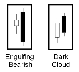
The two sample candle patterns at right
are what we refer to as
2-candle patterns - there are also
3-candle and 4-candle patterns.
These two patterns are very bearish, and
if seen in a rising trend,
suggest a possible abrupt change in trend
to downward.
|
|
One candle can summarise many
Note the following
regarding the sample price chart of
BHP at right:
- This is actually a 1-minute line
chart with a single candle
superimposed. They apply to intraday
charts
also.
- The 1-minute line chart shows the
price action through the day. There
were 9,958 trades during the day,
so the squiggly line on the chart is
joining up 9,958 points. The price
Opened at $43.57 at 10am, then fell to
a Low of $43.28 around
the middle of the day, then rose to a
High of $43.68 late in
the day, then fell a little in the
last few minutes to Close at $43.65.
- A single blue coloured candle is
superimposed on the chart, summarising
the price action for the day -
so it is a daily candle. This is a
good example of a compound candle.
|
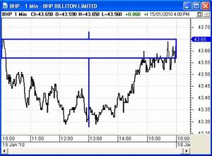
A 1-minute price chart of BHP for the
6-hour
period from 10am to 4pm on 15 January.
Click on the chart for a larger image
in a new window.
|
More information
Also look for more details in Toolbox
Master Index.
Toolbox Members can see more details about
candlesticks...
|
|
More information
There are some free eBook (PDF) Articles on
candles listed here.
Useful
Links
The following web sites have lots of
free information about
candlestick charts and patterns.
History and more at Wikipedia
Bulkowski's Candlestick Patterns
My SMP (Stock Market Power)
Master the Markets - Japanese
Candlesticks
Features
Sensible
Investing - Ask yourself if the advice
you receive
seems sensible.
Funda-Technical
Analysis - A clever blend of
Fundamental Analysis
to identify quality stocks for a watch list, and
Technical Analysis to
time the purchase (and sale) of the stocks to
minimise losses and
maximise profit and capital.
Contrarian Investing Redefined
- The old thinking about contrarian investing now
ought to be
challenged, and somewhat clarified or redefined.
Whatever
you do,
beware of the sharks
in the ocean!

|