Candle-ology
A common
question from those starting out in reading the charts is:
"Should I
use candlestick charts or bar charts?"
See some views on this issue
below.
You are here:
Candlestick Charts
> Candles or Bars?
Related links: Candle Basics
Related links (for Toolbox Members): Candle-spotting (patterns explained);
Candlesticks
Remember, the basic candlestick (see below) indicates the
total range in price during the
"period". On a daily chart, it is the range in price in one day - in
this case on the days of 13, 14 and 15 August.
The candle "body" indicates the price range from the open to the close.
The top of the upper wick (if present) is the high for the period.
The bottom of the lower wick (if present) is the low for the period.
For a greater discussion about the white and black candles see the candle-basics
page.
|
Bars - HLC or OHLC
With the OHLC bar (see below), each vertical bar on the chart shows the
total range in price in the "period". This chart covers exactly the
same days as the candle chart at below left.
On the bar chart, the "tick" to the left of each bar is the open price
for the period, and the tick to the right is the close price for the
period.
"OHLC" is an abbreviation for "Open, High, Low, Close, and
"HLC" is for "High, Low, Close". The HLC chart is used by those people
who believe that the open price for each period is not important.
|
Candles
or bars?
Okay, so, which should you use - a candle chart or a bar chart?
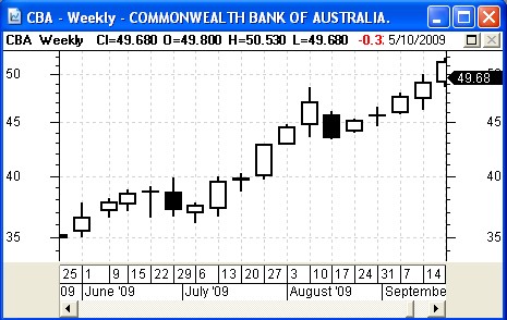
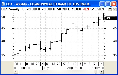
Below are two weekly charts of the same stock (CBA bank) and same
period.
Each individual candle, and each bar, summarises the price action for
one whole week.
Study the two different charts below, and consider these questions:
- At a quick glance, how many of the
weekly candles or bars are "falling" (with the close lower than the
open)? That is, black candles are considered falling.
- At a quick glance, how many of the
weekly candles or bars are "rising" (with the close higher than the
open)? That is, white candles are considered rising.
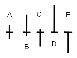
- At a glance, which weeks had the
weekly close roughly the same as the open fot the week? With a candle,
it is a doji pattern (see below right).
- At a glance, which weeks were
bullish (closing on the high for the week, as for week of 27 August)?
|

|

|
SummaryIt seems as though
many of the experts who have been in the industry for a number of years
have been accustomed to bars. But in recent years as candlestick charts
have become more wide spreadspread, many people new to the study have
thought that candlestick charts are easier to interpret "at a glance".
For someone starting out now, it is more likely that candlestick charts will be seen to be easier to use.
|
Doji candles
 |
|
|