Sharemarket candlestick price charts
 The humble candlestick chart
can tell us a lot about the health, mood and
sentiment of
the market. The humble candlestick chart
can tell us a lot about the health, mood and
sentiment of
the market.
See Candlestick basics - The
basics of
how to interpret candlesticks (for relative
novices).
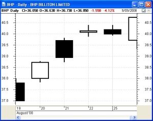
The sample candlestick chart at right is a simple short-term Daily
chart of BHP over a 6-day period in August 2008. Each candle on this chart summarises the price action in the trading of
BHP in each day.
After the normal to and fro of intraday share prices shown in the first three candles here, the fourth candle is almost a Doji candle,
indicating a lack of conviction to keep pushign prices higher. The next
candle is no higher than the Doji, so the market participants are
pausing to re-think the perceived value od BHP shares. That is, the
earlier uptrend is losing steam, and might be about to end. But the
very last candle is a bullish tall white indicating heavy buying
interest again.
Knowing how to read these simple candles can be so very useful in
gauging the mood and sentiment of the market. Candles tell us a whole
lot more about the market than the simple line
chart. They can help to identify likely turning points in a
stock or in the
market index.
See Candlestick basics - The
basics of
how to interpret candlesticks (for relative
novices).
What about bar charts? - See the discussion Candles or bars?
|
Candle
Pattern
Spotting - How to find which pattern
Here is a new approach to make
it easier for you to find your desired candlestick pattern:
- There
are many resources available that describe specific candlestick
patterns - provided you already know the name of the candle
pattern.
- The
biggest challenge for anyone new to candle-spotting is to firstly
recognise that one candle shape is meaningful, or that a couple of
adjacent candles can be a
meaningful candle pattern.
- The graphics here in the
Share
Market Toolbox will help you quickly spot a
pattern,
identify the name of the pattern, and then find further details for the
selected pattern.
- Because the material here is
laid out rather differently to most other candlestick resources, it is
reserved exclusively for Toolbox
Members.
STEP 1 - Individual candle
features
Understand the key features to
look for in individual candles (below).
STEP 2 - The Trend?
On your price chart, are you looking at one or more candles that are:
STEP 3 - Identify the pattern
From
the concise list of relevant candle patterns, select the one that best
fits your pattern, and note the key comments such as:
- key pattern characteristics,
- similarities with other
patterns and why this is different, and
- psychology behind the pattern.
See the concise list of patterns in UP trends, or
the concise list of patterns in DOWN trends.
|
|
Quick Links
(public):
Candlestick basics - The basics of
how to interpret candlesticks
and candlestick charts (for relative
novices).
|
Quick Links (for Toolbox
Members):

Single
Candles
- White, Black, Big, small
- Marubozu
- Doji
- Spinning Top
- Hanging Man
- Hammer
- Shooting Star
- Belt Hold
See single
candle shape details in the Toolbox here, including the same
diagram with pattern names included.
Also see a description of the psychology at play on the Candle Features page.
|

Candle
patterns in Up Trends
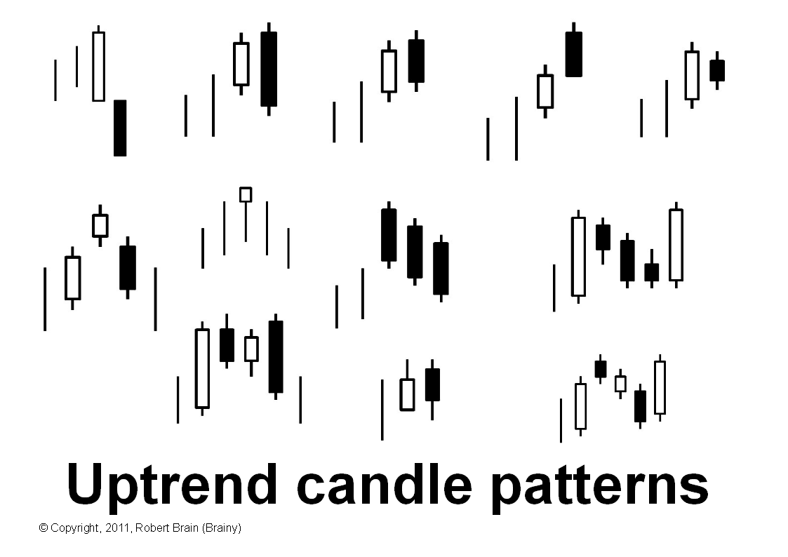
Most of these are reversal patterns, but not all:
- Bearish Engulfing
- Dark Cloud Cover
- Bearish Counterattack
- Bearish Harami
- Bearish Kicker
- Evening Star
- Hanging Man
- Three Black Crows
- Tweezer Top
- Tower Top
- Rising Three Method
- Bullish Mat Hold
Can you see similarities in the top row of 5 candle patterns in this
diagram?
The black candle in each case is less bearish than the one before.
All patterns in this diagram are bearish top reversal patterns, except
two.
Do you know which two and why?
Toolbox
Members see UP TRENDS details and identify candle
patterns here including the same diagram with pattern names
included.
Also see a description of the psychology at play on the Candle Features page.
|

Candle
patterns in Down Trends
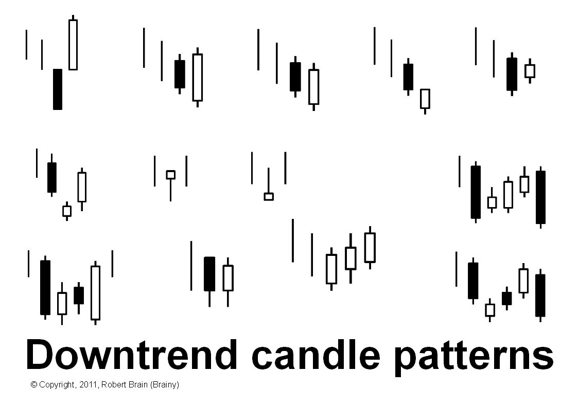
Most of these are reversal patterns, but not all:
- Bullish Engulfing
- Piercing
- Bullish Counterattack
- Bullish Harami
- Bullish Kicker
- Morning Star
- Hammer
- Inverted Hammer
- Three White Soldiers
- Tweezer Bottom
- Tower Bottom
- Falling Three Method
- Bearish Mat Hold
Can you see similarities in the top row of 5 candle patterns in this
diagram?
The white candle in each case is less bullish than the one
before.
All patterns in this diagram are bullish bottom reversal patterns,
except two.
Do you know which two and why?
Toolbox
Members see DOWN TRENDS details and identify candle
patterns here, including the same diagram with pattern names
included, and some real Aussie stock/index samples of the same.
Also see a description of the psychology at play on the Candle Features page.
|
|
|
More information
There are some free eBook (PDF) Articles on candles listed here. Other Articles are in
the Toolbox.
Useful
Links
The following web sites have lots of free information about
candlestick charts and patterns.
History and more at Wikipedia
Bulkowski's Candlestick Patterns
My SMP (Stock Market Power)
Master the Markets - Japanese Candlesticks
Features
Sensible
Investing - Ask yourself if the advice you receive
seems sensible.
Funda-Technical
Analysis - A clever blend of Fundamental Analysis
to identify quality stocks for a watch list, and Technical Analysis to
time the purchase (and sale) of the stocks to minimise losses and
maximise profit and capital.
Contrarian Investing Redefined
- The old thinking about contrarian investing now ought to be
challenged, and somewhat clarified or redefined.
Whatever
you do,
beware of the sharks
in the ocean!

|