|
Brainy's
Share Market Toolbox |
You
are here: Share Market
Toolbox
> ASX Investor Update
> ASX
Investor Update March 2016 - more Info
Related links: Summary list of other ASX articles; About the Share Market; Robert's Philosophy; Share Market GEMs; Share-Market-Ready;Funda-Technical Analysis; Sensible Investing; Contrarian Investing Redefined; |
|||||||||||||||||
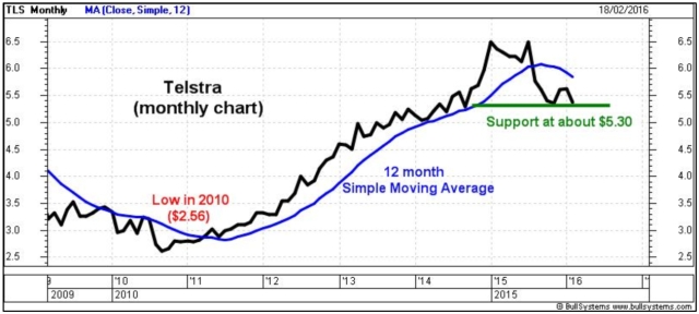
The March 2016 ASX Investor Update newsletterBelow is some additional information, more text, and larger versions of the price charts from Robert's telecoms article in the March 2016 edition of the ASX Investor Update newsletter (click on the images for a larger version). For the published text of the March 2016 article that Robert authored, and the published price charts, see the ASX article here... and the full edition of the March 2016 newsletter.Telecom stocksAny discussion about Australian telecommunication stocks would not be complete without including Telstra. In early February 2016, Telstras market capitalisation was about $66 billion, or nearly 5 percent of the top 200 stocks (the XJO index S&P/ASX 200). As a result, it tends to be a foundation stock in the portfolios of many investors. Especially given its dividend, and its blue chip status. Do refer to the online article at ASX.com.au for the published version of this article. Study the accompanying simple monthly price chart of Telstra since 2009 (click on the chart for a larger image). [Note: A monthly price chart shows the last traded price on the last calendar day of each calendar month, and shows nothing about the range in price during the month.] On this chart we can see that the share price bottomed in 2010, then rallied for four years. The share price has twice tried to break above $6.50 in the last 12 months. On this monthly chart there seems to be price support at about $5.30 this is where buyers have stepped in to snap up the available shares [note: buyers do this because their opinion is that the shares are worth more than this price].
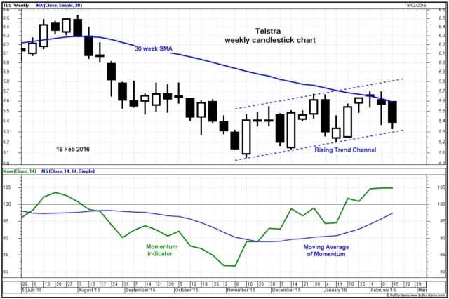
Dont forget that the price chart summarises the opinions and emotions of the market participants, and it shows us their view about fair value for the share price. It is easy for a share price to run up too far too quickly, and to see a pull-back as shown in this monthly chart. However, we need to be a little careful when studying a monthly (or even weekly) price chart because it does not show us the range in price within the month (or the week). The daily chart would actually show us that the highest daily close price in February 2015, and the latest support level, are a little different to whats shown on this monthly chart. The second chart (below) is a weekly candlestick chart, where each candle summarises the price action in one week. A black candle closed the week lower than the open for the week, while a white candle closed higher than the open. The entire range of one candle from the very top to the very bottom indicates the complete intraday trading range during the week. See more details about candles here. In this chart we can see that the Telstra share price fell until November 2015. Since then, the shares have made a series of higher peaks and higher troughs (a technical analysis uptrend) within what we call a rising Trend Channel on the chart. The two parallel lines of this channel indicate the extremities of the price action, and the price has moved up and down within this channel. [This reflects the tug of war between the buyers and sellers, as the buyers outweigh the sellers for a while, then the sellers outweigh the buyers - typical of an auction process.]
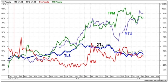
This trend channel indicates that the opinions of the market participants have tended towards the optimistic side, and encouraged a gently rising share price. One of the six tenets of Dow Theory says that an uptrend is likely to continue until it is confirmed to have finished. [In other words, a price trend is a trend is a trend, until it is no longer a trend.] For as long as the share price keeps making higher peaks and higher troughs, then the uptrend is still in place. The rising Momentum indicator in the lower panel of this chart from November indicates the underlying price strength increasing. [The Momentum indicator simply indicates the change in price over a specific time period - in this case, over the previous 14 weeks. Also shown on this chart is the Moving Average of the Momentum indicator, and we can see that it fell toward the middle of the chart, then turned upwards - this is considered a bullish condition.] The latest price data on this chart includes the close on 18th February, the day that Telstra announced their half year results to the market. Within this trend channel, the price was still making higher peaks and higher troughs. Telecom stocks and the sector indexHow does Telstra compare to three other popular telecommunication stocks? And how do they compare to the telecommunications sector index? The next chart (below) shows the comparison of Telstra (TLS) to: TPG Telecom (TPM), Hutchison Telecommunications (HTA) and M2 Group Limited (MTU). In this weekly chart, the vertical axis is the percentage performance of each stock, and the sector index, since early January 2014. Note that the sector index (XTJ) is closely correlated to Telstra (due to Telstras very large relative market cap). These stocks comprise the following percentage portion of the sector index: TLS 73 percent, TPM 9 percent, MTU 2.5 percent and HTA 1.2 percent.
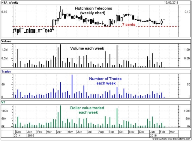
This chart clearly shows that TPG Telecom has been performing consistently better than the other stocks in this comparison, at least from early 2014 until late 2015. [More information about sector indexes - It is useful to note that there are ten sector indexes for the Australian market. Also, that all stocks on the market can be allocated to a sector. However, only stocks from the S&P/ASX 200 index (XJO) are candidates to be included in one of the ten sector indexes. Read more about the market indexes and sectors.] Hutchison Telecommunications (Australia) LimitedHeres an important word about Hutchison Telecom. Many shorter term investors and traders who might consider buying into this stock might also want to be able to exit the position quickly should conditions change. That is, using the next price chart shown below (a weekly candle chart), if the share price were to fall below about 7 cents, we might want to have a Stop Loss condition set such that we would exit the stock below this price. Now if that were the case, we would want a high degree of confidence that we can actually sell the stock. For that to happen, it needs to be likely that there will be buyers at that price.
On this chart, the second pane indicates the volume of shares traded each week. This has varied between about 100,000 and about 1.2 million each week. [The weekly volume has varied between about 100,000 shares and over 1 million shares.] The next pane of the chart shows the number of trades in each week (one trade is the sale/purchase of one parcel of shares, where each parcel might be just a few shares, or as many as thousands of shares). This chart indicates that in the last 12 months there have been between about 10 and nearly 50 trades per week. Thats an average of between 2 and 10 per day. Even at 50 trades per week, or 10 per trading day, thats an average of one trade every 36 minutes. Can you imagine waiting that long to sell your parcel of shares? And what would happen if the potential buyers all disappeared just as you wanted to sell you shares? The bottom pane of the chart shows the dollar value of the shares traded each week. This has varied from as low as about $10,000 per week up to about $120,000 per week. And here is the next issue. If you were to hold a parcel of shares valued at just $10,000 and you wanted to sell them all quickly, that is the equivalent of between about one days worth, or up to one weeks worth, of shares. And a parcel of this size would potentially move the share price. The bottom line is that for the shorter term investors and traders (such as the Nimble Short Term Investor), this stock is probably not liquid enough to be a viable investment. See more information about Stock Liquidity. More Information?Do refer to the online article at ASX.com.au for the published version of this article. Want to understand more about how to interpret the price charts? See the details in the right-hand column above... |
To
print this web page - in your browser select the printing
option "Shrink to fit". View larger versions of the charts below by clicking on the chart. More informationTo understand more about how to interpret the underlying mood and sentiment using the price charts:
Share
Market Terminology
See Brainy's eBook Articles, and the Master Index list for details. Or, search the eBook Articles. Robert Brain provides support to both new and experienced traders and investors. Who
is Robert Brain? 
The toolbox is an arsenal of weapons to help you tackle the share market. See a list of contents on the Toolbox Gateway page. The Share Market - more information about the market and investing and trading.  And whatever you do,
beware of the sharks in the ocean! |
||||||||||||||||
|
The information presented herein
represents the
opinions of the web page content owner, and ©
Copyright 2015-2016, R.B.Brain -
Consulting (ABN: 52 791 744 975).
|
|||||||||||||||||


