Share
price performance after the public float
A collection of
price charts in (reverse) chronological order,
showing some positive and negative stories
regarding high profile IPOs.
Toolbox
Members click on any chart image for a larger
version in a new window.
|
Stock
code,
float/listing date,
and details |
The
first
few weeks or months and
a line chart and/or a candlestick
chart
The candle chart is
useful as it shows the range in price in each period.
Note that these charts might NOT show the latest price
action as they attempt
to show whether investing in the IPO might have
been useful in the medium term. |
Longer
term chart |
DigiCo Infrastructure (DGT)
Float date: Friday 13 December 2024
Offer price: $5.00
First day:
- Open: $4.98
- Low: $4.48
- High: $5.10
- Close: $4.55
Note: A daily candlestick
chart summarises the price action for each day.
|

DGT - The first
one week
(10-minute intraday candle chart)
The first hour of trading
(from 12 noon on Friday 13th December 2024) wasn't bad
for the first couple of hours, but it sold off from 3pm
- see the two Big Black candles among the first five
candles on this chart.
* - A 10-minute candlestick
chart summarises the price action in each 10 minute time
block during the session.
|

DGT - The first
few months
(daily* candle chart)
11 Jan 2025 - This daily
candle chart is showing the first 4 weeks of trading for
this newly listed stock. Note the first two very tall
black (daily) candles, most of which are below the IPO
offer price of $5 (the horizontal dotted red line), show
the early sell-off. Then most of the trading for the
next 4 weeks is within the range of $4.40 to $4.70 -
below the IPO offer price. If you had have participated
in this float and continue to hold the stock, you will
be under water (hence the background colour for this
particular table cell is pink).
|

DGT - After one
year
(weekly* candle chart)
26 Dec 2025 - This weekly
candle chart shows about 12 months worth of price
action. Note that the share price bottomed in April
2025, then rose to less than the IPO price before
commencing a 5-month downtrend to as low as $2.50.
At one point, the share
price was down about 52 per cent from the IPO price. A
clear loser over this period.
|
Guzman y Gomez (GYG)
Float date: 20 June 2024
Offer price:
$22.00
First day:
- Open: $30.00
- Low: $29.29
- High: $30.99
- Close: $30.00
Note: A daily candlestick
chart summarises the price action for each day. Each
candle on a weekly candle chart summarises the price
action for each week.
|

GYG - The first 4
weeks
(daily candle chart)
The first day of trading is
very informative. Trading opened at $30 - that's a whole
$8 above the offer price of $22, or about 36 per cent
higher. Then during the day it traded up and down a
little and closed the day at the open price - forming a
doji candle - indicating general
agreement on the price.
Also notice that some 6
days later there was a 2-day sell-off - likely to be
profit takers.
|

GYG - The first 3
months
(daily candle chart)
This daily candle chart of
the first 3 months of trading shows the early sell-off
in late June (two tall black candles), then a persistent
uptrend to a peak on 11 September
to be up 90 per cent over this period.
|

GYG - The first
18 months
(weekly* candle chart)
After 18 months of trading,
this weekly* chart shows the early uptrend from July
into September 2024, then a flat period until late
November.
A year later, by late 2025,
the share price had fallen to the level of the float
price some 18 months prior. If you had bought in near
the top for more than $40 around December 2024, then by
December 2025 you were down 45 per cent.
|
Nuix Limited (NXL)
Float date: 4 December 2020
Offer price: $5.31
First day:
- Open: $8.50
- Low: $7.27
- High: $9.00
- Close: $8.01
Note: A daily candlestick
chart summarises the price action for each day.
|
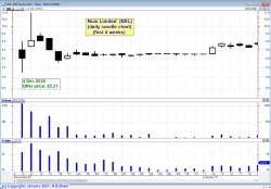
NXL - The first
four weeks
(daily* candle chart)
The first day of trading (4
Dec 2020) might be a black candle (indicating the daily
close lower than the open); but with all trading above
$7, this is well above the IPO issue price of $5.31.
For the rest of this chart
over 4 weeks, NXL has traded in a mostly narrow band
between $8 and $9, as though the market participants
agreed is was worth more than $8 but less than $9.
* - A daily candlestick chart
summarises the price action in each day.
|
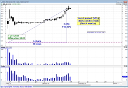
NXL - The first 3
months
(daily* candle chart)
25 Jan 2021 - So far we
only have 7 weeks of price data here. Note a tall white
candle on this daily chart at 4th January, after which
the daily candles are all mostly taller than prior to
this date, and they start to climb higher. I tend to use
a log price scale ( see a discussion here), otherwise
the tall candles here would look even taller. |

NXL - The first 8
months
(weekly* chart)
The
weekly*
chart above shows the trading over the first eight
months. Remember that on a weekly candle chart, each
candle summarises the price action in one week.
On this chart we can see that
the price stayed above the offer price for at least 2
months, then commenced a downtrend until the share price
dropped below about $3 to be down 72 per cent from the
offer price. (This is one reason that I don't like
IPOs).
* - A weekly
candlestick chart summarises the price action for each week.
|
Booktopia (BKG)
Float date: 3 December 2020
Offer price: $2.30
First day:
- Open: $2.86
- Low: $2.58
- High: $2.90
- Close: $2.72
Note: A daily candlestick
chart summarises the price action for each day.
|
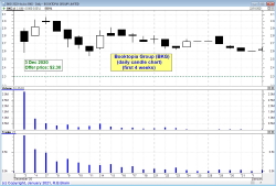
BKG - The first
four weeks
(daily* candle chart)
The horizontal dotted line
indicates the IPO offer price (aka float price), and all
trading in the first four weeks is clearly above that
level. So IPO participants were in the money from day
one.
The trading range of the
first three days (from above $2.50 to about $3) covers
most of the trading for the first four weeks shown here.
* - A daily candlestick chart
summarises the price action in each day.
|
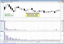
BKG - The first 3
months
(daily* candle chart)
22 Jan 2021 - So far we
have just 7 weeks of price data here, and the trend of
the first few weeks has continued with the price stuck
within a range - but notice that the highest values are
progressively lower and lower. From about $3 on day
three, down to below $2.90 a week later, then below
$2.80 on 29th December, then mostly below $2.70 for the
three weeks to 22 January. This indicates that market
participants are less and less confident that the stock
is worth any more than its current price.
|

BKG - 18 months
(monthly* chart)
The
monthly* chart above shows how the share price performed
after topping in August 2021 - it commenced a downtrend
that didn't stop. It fell 98 per cent, and then
de-listed.
* - A monthly
candlestick chart summarises the price action for each month.
|
HiPages (HPG)
Float date: 12 November 2020
Issue price: $2.45
First day:
- Open: $2.84
- Low: $2.46
- High: $2.55
- Close: $2.46
* - A daily candlestick
chart summarises the price action for each day. A
weekly chart summarises the price action for one week, and
shows the high for the week, the low for the week, and the
open and close prices for the week. Read more
about candlestick charts. |
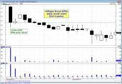
HPG - The first 4
weeks
(daily* candle chart)
Firstly, note that the
trading on day one (12 November) ranged from the open at
$2.84 down to the close at $2.46, and the offer price
was only one cent lower at $2.45. So there was no strong
conviction that the shares were worth much more than the
offer price.
Then for the rest of the
first 4 weeks shown here, the share price has drifted
lower (actually a downtrend), After the second week,
any IPO participant was under water.
* - A daily
candlestick chart summarises the price action for each day.
|
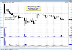
HPG - The first 3
months
(daily* candle chart)
Now with more than 2 months
of price data we can see that the initial downtrend
lasted for 5 weeks until 21 December, with a Big White
candle on 22 December (Christmas holiday week) pushing
the price up to an intraday high exactly equal to the
IPO float price (some people might call that suspicious
as though some of the initial float participants wanted
to force a close out of their position before their
Christmas holiday).
However, from Christmas
onward, the price has resumed its downtrend and float
participants are still underwater. Many astute investors
would look at this downtrend and consider the likelihood
of it continuing, and close out a position to lock in
the loss and protect their capital from any further
downside.
|

HPG - 5 years
(monthly* candle chart)
About a year after listing,
the share price fell below the issue price of $2.45, and
kept going. It bottomed around 65 cents on two occasions
in 2023, then rallied to nearly $1.50 before falling
again. And it fell to more than 60 per cent below the
issue price.
In December 2025 it had
been trading around $1.25, still well below the issue
price.
|
Aussie Broadband (ABB)
Float date: 16 October 2020
Offer price: $1.00
First day:
- Open: $1.73
- Low: $1.68
- High: $1.73
- Close: $1.68
Note: A daily candlestick
chart summarises the price action for each day.
|
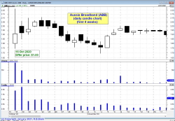
ABB - The first 4
weeks
(daily* candle chart)
Firstly, note that the
first day of trading is mostly above $1.75, which was
well above the offer price of $1.00 So IPO participants
were well in the money.
Then for the rest of the
first 4 weeks shown here, the share price has ranged
between a low of $1.70 and a high of $2. It is common
for a share price to turn at a round dollar amount (such
as $2). IPO participants were still well in the money
for these first four weeks.
* - A daily candlestick chart
summarises the price action in each day.
|

ABB - The first 3
months
(weekly* candle chart)
With about 3 months of
price data now, this daily candle chart shows the first
four weeks from the previous chart (at left), plus the
rapid climb higher from about 27 November for a week or
so (around the middle of this chart).
Then through most of
December the price initially fell back to a floor of
just under $2 before trying to rally some more. However
we interpret this, the IPO participants are still well
in the money.
|

ABB - 5 years
later
(monthly* candle chart)
The Aussie Broadband share
price opened on the float day well above the issue price
of $1, and has remained well above that level ever since
(as at December 2025). Mind you, though, in 2022 it fell
back to about $2 before slowly rising over many months.
In September 2025 it had
reached about 495 per cent above the issue price - a
great reward for anyone who bought in early.
* - A monthly candlestick
chart summarises the price action in each month.
|
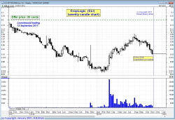
CropLogic Limited (CLI)
www.croplogic.com
Float date: 12 September 2017
Issue price: $0.20
First day:
- Open: $0.16
- Low: $0.14
- High: $0.175
- Close: $0.155
19 November 2019 - Trading halt. No
further trading.
2020 - Entering administration and
company deregistered.
* - A daily candlestick
chart summarises the price action for each day. A
weekly chart summarises the price action for one week, and
shows the high for the week, the low for the week, and the
open and close prices for the week. Read more
about candlestick charts. |
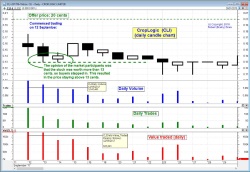
CLI - The first 15 days
Daily* candle chart
This daily* chart shows the
first 14 days of trading and indicates the issue price
at 20 cents near the top of the chart (a horizontal
dashed line), then the first day of trading (the first
candle) is a short-bodied candle with tails, well below
the issue price.
Over the next few days of
trading, the share price stayed roughly within the range
of the first day, and ventured a little lower, but
stayed above 13 cents (at least until 25th September).
That is, the market participants were all believing that
the stock was worth more than 13 cents (a support
level).
The candle on 25th September
has a longer lower tail that penetrates below the 13
cent support level, indicating that some market
participants no longer believed the shares were worth
more than 13 cents.
* - A daily
candlestick chart summarises the price action for each day.
|
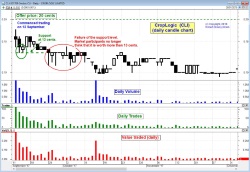
CLI - The first 3 months
Daily* candle chart
This daily* chart is similar
to the first one at left (which shows 14 candles), but
covers a period of more than 2 months. You can see the
same first 14 daily candles at the left end of this
chart.
Once the trading broke below
the 13 cent support level, the trading continued for
several days in a range mostly below 13 cents, with one
exception on 2 October.
By mid-October the share
price touched a low of about 10 cents, and then managed
to trade above this level in the following weeks.
For the technical analysts
who understand how to read the Volume bars (and the
Trades and Value) in the lower window panes, there is
more information to be gleaned about the opinions of the
market participants.
|
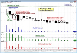
CLI - The first 4+ months
Weekly* chart
The
weekly*
chart above shows the trading over the first four
months. Remember that on a weekly candle chart, each
candle summarises the price action in one week.
On this chart we can see that
the price stayed above the 10 cent level until the week
of 27 November. Across the rest of this chart the price
tended to trade lower, and stayed below 10 cents from
the week of 11 December.
2019
- Permanent trading halt
click for a larger version
in a new window
* - A weekly
candlestick chart summarises the price action for each week.
|
Afterpay (APT)
Float date: 29
June 2017
Offer price: $1.00
First day:
- Open: $2.70
- Low: $2.65
- High: $2.70
- Close: $2.70
Note: A daily candlestick
chart summarises the price action for each day.
|
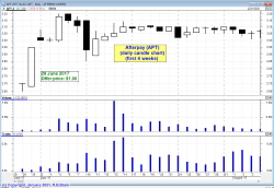
APT - The first 4
weeks
(daily* candle chart)
The first day of trading
here shows a clear lack of commitment about the share
price, with the price ranging only between a low of
$2.65 and a high of $2.70. Even so, this is well above
the issue price of $1.00.
After the first 8 days or
so, the price settled into a range between about $3 and
$3.15 - well above the issue price.
* - A daily candlestick chart
summarises the price action in each day.
|
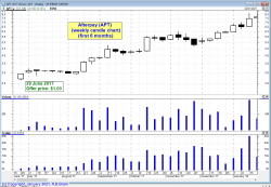
APT - The first 6
months
(weekly* candle chart)
This weekly chart shows 6
months of price action, and that for the first weeks
until mid-August the share price was fairly stable, but
then from mid-August it took off in a good uptrend
across this chart, rising to above $7 by mid-January
2018. That's a very nice profit for the early investors.
Mind you, this sort of
share price performance is not common with regular IPOs.
|
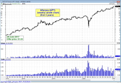
APT - The first 3
years
(weekly* candle chart)
Now with more than 3 years
of price history we can see that the share price has
looked back only once during the coronavirus pandemic of
March 2020.
Except for that
interruption, this chart clearly shows a steady uptrend
taking the share price from the original offer price of
$1 to above $100 in late 2020. That is a very nice
profit for the believers who stayed onboard, and for
those investors and traders who joined the trend.
|
Bingo Industries (BIN)
Float date: 3 May 2017
Offer
price: $1.80
First day:
- Open: $1.73
- Low: $1.68
- High: $1.73
- Close: $1.68
Note: A daiy candlestick
chart summarises the price action for each day.
|
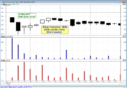
BIN - The first
four weeks
daily* candle chart)
Bingo Industries floated on
3 May 2017 at an offer price of $1.80. On the first day
it traded below this level, and fell further on the
second day. Then for the rest of its first 4 weeks it
continued to trade around this level - between about
$1.65 and $1.73. That's below its issue price with IPO
participants under water.
* - A daily candlestick chart
summarises the price action in each day.
|
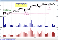
BIN - The first
12 months
(weekly* candle chart)
This chart is a weekly*
over a 12 month period and shows that after the for few
weeks under water, the share price pushed above its
issue price in August 2017, and continued to trend
higher to above $2.50, putting the IPO participants into
a nice profit. In fact, the trend ruler on the chart
shows a 68 percent rise over 52 weeks (a very nice
profit).
|
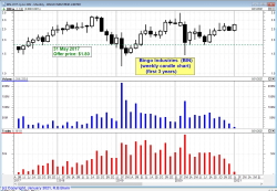
BIN- The first 3
years
(monthly* chart)
This is a monthly* chart
over the first 3 years. It shows that after hitting
above $3 in mid-2018, the share price fell back to the
issue price before rallying in late 2019, and falling
again in 2020.
Is there a lesson to learn
from this share price performance? One lesson is that a
price increase is not guaranteed, and that sometimes it
can pay to lock in profits and protect capital.
* - A monthly candlestick
chart summarises the price action each month.
|
Hot Copper (HOT)
http://investors.hotcopper.com.au
15 September 2016 (11am)
Offer
price: $0.20
First day:
- Open: $0.23
- Low: $0.225
- High: $0.27
- Close: $0.265
Note: An hourly candlestick
chart summarises the price action for each hour.
|
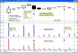
HOT - The first two days
only
(hourly* candle chart)
On day 1, in the first hour
of trade (from 11am), the share price opened at 23c,
above the issue price of 20c. For the rest of the day,
in each hour, the price moved higher to close the day at
26.5cents.
Day 2 - High volume with a
black candle as sellers took profits. Price stayed
mostly above 24c during this day. Volumes mostly lower
each hour, and the number of trades each hour below 20
(ie. max of one every three minutes, suggests not a lot
of interest).
Day 3 - No trade in the first
hour.
* - An hourly candlestick
chart summarises the price action in each hourly period.
|
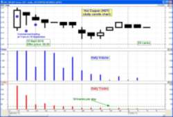
HOT - The first few weeks
(daily* candle chart)
From day 2 onwards for 6
days, the trading was within the range of the first day,
and progressively lower.
Trading on Monday 26 Sept
fell below the previous trading range but stayed above a
floor (a support
level) of 21cents.
The overall price trend on
this chart is down, with a Lower Peak on 30 Sept (the
high of the daily candle), and a Lower Trough on 26, 27,
and 28 Sept (the lows of the three candles). Read more about price trends.
|
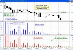
HOT - The first 6+ months
(weekly* chart)
On this chart we can now see
a confirmed downtrend, with a sequence of lower peaks
and lower troughs.
For about 5 weeks through
December 2016 and into January 2017 the share price
hovered around the IPO float price level of 20 cents,
before continuing its movement lower.
Note the number of weekly
trades in the bottom pane is less than 30 trades per
week from mid-November onwards. Many traders look for
more than 50 trades
per day on average.
|
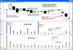
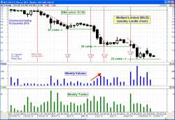
Wellard Limited (WLD)
www.wellard.com.au
10 December 2015 (12pm)
Offer price: $1.39
First day:
- Open: $1.39
- Low: $1.31
- High: $1.39
- Close: $1.39
This case study sample is a classic example of how there
were several warnings about potentially lower prices
ahead, and investors could have cut losses, and protected
capital, by closing a position. Make sure to read the
comments at right about each of these three price
charts.
As at early October 2016, WLD shares are more than 80
percent below their issue price. So $10,000 invested at
IPO time was now worth only $2,000 - that's a
reduction of $8,000. It doesn't seem to make sense to hold
on for this long in the hope of a turn around - that mind
set is for the big guns with lots of money (the fund
managers who manage other people's money).
See latest price chart at ASX.com.au.
June 2016, news in
The Age:-
Cattle exporter joins list of worst IPOs
this year
* - A daily candlestick
chart summarises the price action for each day. A
weekly chart summarises the price action for one week, and
shows the high for the week, the low for the week, and the
open and close prices for the week. Read more
about candlestick charts. |
WLD - The first 18 days
(daily* candle chart)
The first candlestick is very
telling - it closed at the open price for the day
($1.39), but traded as low as $1.31 on rather high
volume (compared to the following days). This candle is
a Dragonfly candle, and shows the presence of sellers
during the day who were over-powered by the weight of
buyers.
However, over the next 5
trading days the share price made lower highs each day.
Then for the next 11 trading days the share price was
stuck in a narrow range between $1.39 (the float price)
and a low of about $1.35 (a support
level). Investors were not sure whether to support
higher prices by buying more, or to sell.
The answer came on 6th
January with trading below the $1.35 support level, on
volume that was higher than most prior days.
We also notice on this chart
that the daily volume
and daily trades
values were high enough to make this a liquid stock and
able to be traded on the basis that a sell order would
probably be filled quickly. (Read more at
Stock Liquidity.)
* - A daily candlestick chart
summarises the price action for each day.
|
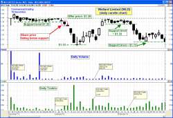
WLD - The first three
months
(daily* candle chart)
After
falling below the initial support level of $1.35 on 6th
January, then next few candles are mostly Big Black
ones, with a very bearish Big Black candle on very high
volume on 11 January. The price settled at the
close on 12 January at $1.10 - this was the lowest level
for the price for some time to come.
The share price then rallied
through January to just under the float price, and again
traded in a narrow range for 9 days, with a new support
level at about $1.32. Then on 8th February it again fell
below this support to sit above $1.13 - a new support
level.
|
WLD - The first 10 months
(weekly* chart)
The
price
action described at left in the two daily charts is
covered on the above weekly chart in just the first 11
candles. After that, the share price continued the fall
that it started on 8th February, and paused the fall
above 67 cents in early April. A red dotted line is
drawn on the chart above the price action to indicate
the confirmed downtrend
(a sequence of lower peaks).
The astute technical analyst
probably exited the position during this downtrend,
because of the belief that a confirmed downtrend is
likely to continue until it is confirmed to be over
(refer one of the six tenets of Dow Theory).
For any investors who held on
further, another sell-off took place over three weeks in
May/June, and then another in August. There were plenty
of opportunities to cut losses and close a position.
|
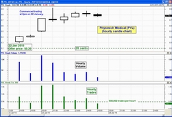
Phytotech Medical Limited (PYL)
Since July 2015:
Known as MMJ Phytotech
Limited.
www.mmjphytotech.com.au
22 January 2015 (2pm)
Offer
price: $0.20
First day:
- Open: $0.32
- Low: $0.305
- High: $0.42
- Close: $0.41
Note: An hourly candlestick
chart summarises the price action for each hour.
July 2015:
Phytotech Medical merged into MMJ to become MMJ Phytotech
Limited.
|
PYL - The first two days
only
(hourly* candle chart)
An hourly chart showing just
the first two days of trading - a winner from day one
* - An hourly candlestick
chart summarises the price action in each hourly period.
|
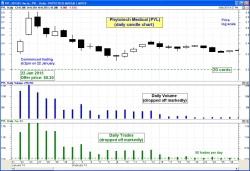
PYL - The first few weeks
(daily* candle chart)
27
February 2015 update - This daily price chart
(also showing volume in the middle pane and Trades in
the lower pane) clearly shows the strong price run in
the first 2 days of trading (up to about 80 cents),
followed by the slump back below 30 cents by 9th
February. For the rest of February, the price has traded
within the range of about 31 to 43 cents. Still well up
on the issue price.
|
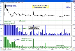
PYL - The first few
months
(daily chart)
10
June 2015 update - This latest price chart
continues to show the small trading range, but at lower
levels than back in February. Except for one price spike
to 34 cents on 28 June, the price has traded within the
range of 26.5 to 33 cents tops. This is still above the
issue price, but any investor who has been holding on
has missed out on other investment opportunities. Also
note that the high daily volumes (and trades) of the
first few weeks have now dissipated, and in fact the
number of daily trades has fallen below the 50 per day
level.
|
oOh!media Limited (OML)
www.oohmedia.com.au
17 December 2014 (12pm)
Offer
price: $1.93
First day:
- Open: $1.89
- Low: $1.80
- High: $1.90
- Close: $1.90
Note: A daily candlestick
chart summarises the price action for each day.
See latest price chart at ASX.com.au.
Updated: 10 June 2015
Update 4 October 2016:-
Now this stock has been a winner. The last chart at right
shows the share price up to a peak of around $2.70. Since
then, the price continued to rally to a peak about $5.50
in August 2016. That's an increase of about 180 percent
(or 88 percent per annum annualised).
|
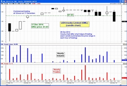
OML - The first few days
only
(hourly* candle chart)
An hourly chart showing just
the first 6 days of trading - below, then above,
and below, the issue price.
* - An hourly candlestick
chart summarises the price action in each hourly period.
|
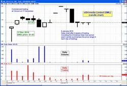
OML - The first 4 weeks
(daily* candle chart)
9
January update - The share price has traded in
a rather small range up to 5 percent above the issue
price. We have now included in the Daily Trades in the
lowest pane of the chart, and showing that it has been
trading at less than 50 times per day on most days
(which for some traders makes it illiquid - see more details about stock liquidity).
* - A daily candle chart
summarises the price action each day.
|
OML - The first few
months
(daily chart)
June
2015 update - The share price initially went no
where for a few weeks, and then shot up about 30 percent
in the next month. Since early March it has mostly
traded sideways until the short term run in early May,
and has recently fallen away from that high.
Nonetheless, it has been up, and is still up, about 30
percent from the issue price.
|
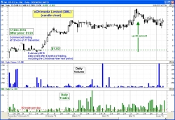
Godfreys Group Limited (GFY)
www.godfreys.com.au
10 December 2014 (12pm)
Offer
price: $2.75
First day:
- Open: $2.88
- Low: $2.78
- High: $2.88
- Close: $2.85
Note: A daily candlestick
chart summarises the price action for each day.
See latest price chart at ASX.com.au.
Updated: 10 June
2015
| Update 4 October 2016:
The last share price shown in the right hand chart
was in June 2015, and the stock was up on the
issue price. However, by October 2015 the price
fell heavily below a support level of about $2.90
(chart not shown here). By February 2016 the share
price was down into a trading range of between
$1.00 and $1.20. Then by September 2016 it was
down under 85cents. This is another stock were it
was initially a winner, but turned into a capital
killer, and in hindsight should have been sold off
to protect capital. |
|
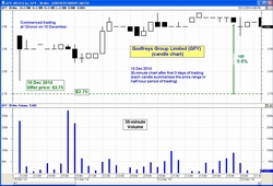
GFY - The first few days
only
(30 minute* candle chart)
Trading well above the float
price from day one.
* - A 30 minute candle chart
summarises the price action in each 30 minute period.
|
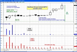
GFY - The first 5 weeks
(daily* candle chart)
9
January update - The share price continued to
trade in a very small range until early January when it
took off to end up 16 percent higher on 9 January. We
have now included in the Daily Trades in the lowest pane
of the chart, and showing that it has been trading at
less than 50 times per day (which for some traders makes
it illiquid - see more
details about stock liquidity).
* - A daily candle chart
summarises the price action each day.
|
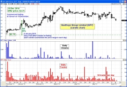
GFY - The first few
months
(daily candle chart)
June
2015 update - An investor in this IPO could
have sold their stock in early March for at least a 20
percent gain. Anyone who has held on until the latest
date on this chart (9 June) would have seen the value
stagnate for the last 3 months. Also, we can see in the
bottom pane of the price chart "Trades" that the number
of trades each day is below the 50 level, so that it's
viability as a liquid and tradeable stock would have to
be questioned.
|
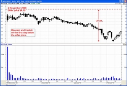
Estia Health Limited (EHE)
www.estiahealth.com.au
5 December 2014 (12pm)
Offer
price: $5.75
First day:
- Open: $4.98
- Low: $4.71
- High: $4.99
- Close: $4.74
Note: A daily candlestick
chart summarises the price action for each day.
See latest price chart at ASX.com.au.
Updated: 5
June 2015
NOTE (October 2016):
The share price peaked in November 2015 (not shown in the
charts here) at about $7.80, then commenced a clear
downtrend to a pause in June to August 2016, then it fell
off a cliff in August 2016. At last glance it was trading
between $3.00 and $3.50, which is well below the issue
price. The lesson here is that if a downtrend is
confirmed, then consider liquidating to lock in profits
and protect the capital from further possible downside.
There is no point holding on forever. See the latest price
chart far right.
|
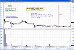
EHE - The first few days
only
(30 minute* candle chart)
Trading well below the float
price from day one, and after one week is about 18
percent below.
* - A 30 minute candle chart
summarises the price action in each 30 minute period.
|
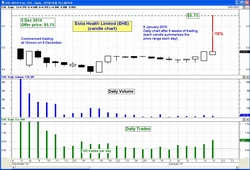
EHE - The first 3 weeks
(daily* candle chart)
9
January update - The share price has continued
to trade in a consistent range about 5 percent below the
issue price. We are also showing the number of trades
each day, with recent values between about 100 and 500,
which makes this a liquid stock (for some traders - see
more details
about stock liquidity).
* - A daily candle chart
summarises the price action each day.
|
")
EHE - The first few
months
(daily chart)
June
2015 update - This stock has trended higher
fairly consistently since the lows of December-January.
It finally pushed above the issue price in February, and
retreated back to sit on that price in April. Overall -
it has not been very profitable yet.
|
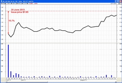
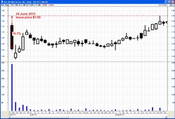
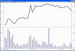
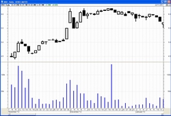
Bapcor (BAP)
www.bapcor.com.au
(formerly known as Burson Group, renamed in 2016)
24 April 2014 (12 noon)
Issue
price: $1.82
First
day: Close $2.05
*Note: A candle on a daily candlestick
chart summarises the price action for each day, and
each candle on a weekly candle chart summarises the price
action for one week.
See latest price chart at ASX.com.au.
|
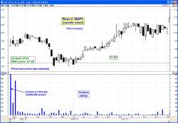
BAP - The first3 months
(daily candle* chart)
Observations:
Up for a few days, then down to about the issue price
before consolidating at that level for about 10 days
while investors contemplated protecting their capital by
selling. Once all sellers at that level were
satisfied, the price rallied to above the issue price
and consolidated again (more contemplation by
investors).
|
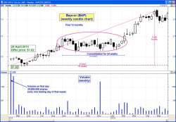
BAP - The first 12 months
(weekly candle chart)
Observations:
After about 4 months the price plateaued and
consolidated for about 24 weeks before rallying further.
Investors appear to have been contemplating whether a
higher price could be justified.
|
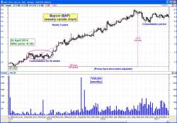
BAP - Almost 3 years
(weekly chart)
Observations:
More than two years since listing, the price
peaked at about $6.50 (about 240 percent increase); but
fell away in Sept-Oct 2016 and consolidated again (under
$6). Even so, still a nice profit.
|
Medibank Private Limited (MPL)
www.medibank.com.au
25 November 2014 (12pm)
Initial indicative range:
$1.55 to $2
Offer price for retail investors: $2.00
Offer price for
institutions: $2.15
First day:
- Open: $2.22
- Low: $2.14
- High: $2.23
- Close: $2.14
This float would have to be the biggest, most talked about
float in 2014. The public offering was well
over-subscribed, with the allocation to retail investors
scaled back.
Note: A daily candlestick
chart summarises the price action for each day.
See latest price chart at ASX.com.au.
Updated: 5
June 2015
Update 4 October 2016: The share price finally
broke above the $2.50 level in March 2016 (not shown on a
chart here) to trend higher to a peak above $3.20 in
May-June 2016. However, the share price gapped lower in
August 2016 and down-trended to under $2.50 in late
September 2016.
|
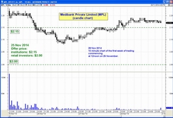
MPL - The first few days
only
(10 minute* candle chart)
Trading above the retail
float price, but hovering around the institutional price
(hence some fund managers are not happy).
Trading in the first 3 days
(at about $2.20) was above the institutional float
price; but with black candles indicating a tendency to
move lower.
* - A 10 minute candle chart
summarises the price action in each 10 minute period.
|
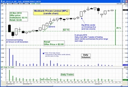
MPL - The first 7 weeks
(daily* candle chart)
9
January 2015 update - Since the last update
below, the share price has moved higher to be about 20
percent above the (retail) offer price, and is also well
in the money for the institutional investors.
26
December update - For the first two weeks of
trading, the share price hovered around the $2.15 level
- the institution's offer price. Then in the last hour
of trading on 8th December, a larger number of shares
traded hands, pushing the price above the recent trading
range. After another week, the price has rallied
strongly on the Christmas Eve trading half day (trading
ends at 2pm on Christmas Eve).
* - A daily candle chart
summarises the price action in each hour.
|
")
MPL - The first 6 months
(daily chart)
June
2015 update - MPL formed a Double Top pattern
in February, and started trending down, and is now below
the institutional issue price, and not much above the
retail offer price.
|
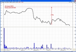
Nine Entertainment Co (NEC)
www.nineentertainment.com.au
6 December 2013
Offer price: $2.05
First day:
- Open: $2.02
- Low: $1.975
- High: $2.07
- Close: $2.98
Note: A daily candlestick
chart shows the range in price during each day.
NEC traded below the issue price for several weeks, then
moved higher (with an indication of buyer support
reflected in the breakout candle).
See latest price chart at ASX.com.au.
Updated: 31 July 2014
Update 4 October 2016:
The downtrend shown on the last chart at right from a peak
in April 2014 continued into January 2015 to see a low of
about $1.65. After a recovery, the share price ended up
falling to lows of under $1.00 in August 2016. This
is another example of how any investors who "believed in
the company" and held on for the longer term have seen
their capital diminish.
|
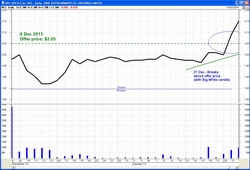
NEC - The first 6 weeks
(daily line chart)
NEC traded below the issue price
for several weeks, then moved
above the issue price. |
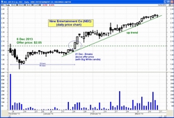
NEC - The first 3 months
(daily candle chart)
NEC turned up above the offer price
after several weeks.
(Toolbox Members click on the chart
for a larger version) |
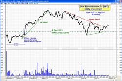
NEC - The first 8 months
(daily chart)
After 8 months of trading, the share price fell away from
March-April highs
back to the issue price.
|
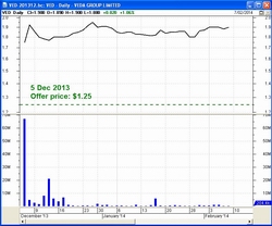
Veda Group Limited (VED)
www.veda.com.au
5 December 2013
Offer price: $1.25
First day:
- Open: $1.74
- Low: $1.63
- High: $1.78
- Close: $1.75
Note: A daily candlestick
chart shows the range in price during each day.
See latest price chart at ASX.com.au.
Update March 2016:
Referring to Chart VED#4
at right, we can see from the end of the chart VED#3 the
share price rallied back up towards the $2.50 peak it had
already reached back in March 2014, then traded sideways
between $2.15 and $2.50 until August 2015. At that point
the price fell sharply to hit $2.00 in mid-September 2015,
then spiked to above $2.60 (on 18 Sept 2015). It then
rallied slowly higher to $2.82 where it entered a trading
halt on 11 February 2016 due to a takeover by Equifax Inc.
|
VED - The first few weeks
(daily line chart)
Veda has traded well above the
issue price for at least the first
few weeks. |
VED - The first few weeks
(daily candles)
|
Chart VED#3
VED - The first 8 months
(daily candles)
Even after
a downtrend from March to July, stock is still 47 percent
above issue price.
Chart VED#4
VED - All price action
(Weekly candles)
(Dec 2013-Feb 2016)
|
Dick Smith (DSH)
Company now delisted
see details at www.delisted.com.au
Floated: 4 December 2013
Offer price: $2.20
First day:
- Open: $2.28
- Low: $2.16
- High: $2.32
- Close: $2.20
Note: A daily candlestick
chart shows the range in price during each day.
NOTES:
With reference to the Chart
DSH#4 at right, we note that after the share
price had traded above a support level of about $1.92
for many months, the Big Black candle on high volume in
August 2015 was the start of a final downtrend.
The Downtrend line sitting above the share price on the
chart appears to act as a ceiling above the price. By
the time the company was delisted in December 2015, the
share price had fallen 83 percent below its issue price
two years earlier.
As often happens with falling share prices, this price
chart provided ample opportunity for investors to see
the writing on the wall, and to reduce or close a
position and protect their investment capital from
further downside.
|
DSH - The first 2 months
(daily candle chart)
NOTES:
The Dick Smith (DSH) share
price moved either side of it's issue price in
the first few weeks.
Daily volume rather high on
the first day (normal for a float), but subsequently
fell away.
|
DSH - The first 8 months
(daily candles)
NOTES:
This daily candle chart shows
a confirmed down trend "channel" from the highs of
January 2014. (The two channel lines are not parallel so
perhaps this should really be called a falling flag
pattern).
A Big Black candle on 19 February
with much higher volume indicates an abundance of
sellers wanting to exit their positions. In the
following weeks the price rallied because enough buyers
thought the price was a good value proposition (later
proved to be wrong).
|
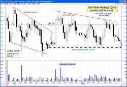
Chart DSH#3
DSH - The first 19 months
(weekly candles)
NOTES:
Basically, the share price in
this period (December 2013 to July 2015) moved within a
range above about $1.92. The highs of the highest
candles were successively lower, suggesting that
investors were not convinced the shares were worth any
more than the issue price of $2.20.
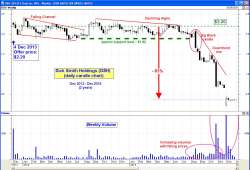
Chart DSH#4
DSH - The entire 2 years
(weekly candles)
|
Twitter (TWTR)
https://about.twitter.com/investor
8 November 2013
Offer price: US$26
The two charts at right look a little odd, with all the
price action at the top of the chart. This is because the
stock was offered at US$26, but then traded well above
this price from day one. This means that those who bought
into the IPO were significantly in the money (in the first
few weeks.
See latest price chart at Yahoo.
Updated: 31 July 2014 |
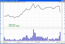
TWTR - The first 3 months
(daily line chart)
Twitter opened above the issue price and traded strongly
higher for a few weeks, then moved sideways until early
February. |
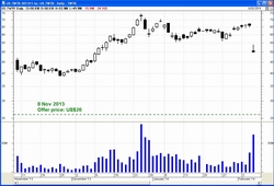
TWTR - The first 3 months
(daily candles)
See the updated chart and analysis at right before you
draw a conclusion about the value of investing in IPOs. |
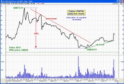
TWTR - The first 9 months
(daily line)
Twitter rallied strongly in the first weeks, then fell 58
percent almost back down to the issue price. It has
rallied again since early June. Even though investors are
now in profit, this is a good example of being prepared to
protect profits by selling once a downtrend has started.
|
Freelancer Limited (FLN)
www.freelancer.com
15 November 2013
Offer price: 50c,
with first days trading well above.
First day:
- Open $2.50
- Low: $1.42
- High: $2.60
- Close: $1.60
Note: A daily candlestick
chart shows the range in price during each day.
See latest price chart at ASX.com.au.
Updated: 31 July 2014
|
FLN - The first few weeks
(daily line chart)
Trading above the issue price,
then mostly sideways for
the first few weeks. |
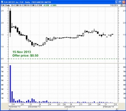
FLN - The first few weeks
(daily candles)
This candlestick chart clearly shows the range in price,
with a very tall candle (large range) on day one. |
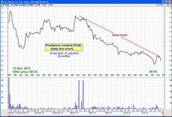
FLN - The first 8 months
(daily line chart)
This chart shows the sharp rally on day one,
followed by a fall in the following days, then a tend
higher to almost the November highs followed by a
consistent downtrend from March 2014.
|
Sealink Travel Group (SLK)
www.sealink.com.au
16 October 2013
Offer price: $1.10
See latest price chart at ASX.com.au.
See the charts at right for details (Toolbox Members click
on the chart for a larger version).
NOTE: A note about
liquidity (noting the number of trades each day/week in
the charts at right):
If an investor/trader is keen to "protect capital", and
intends to sell a stock once price weakness is confirmed,
then it it important to have some buyers in the market who
are ready to buy the stock. If a stock trades less than 50
times per day (for example), this equates to an average of
one trade about every 7 minutes. When price weakness
becomes obvious to everyone, the chances of having a buyer
in the market are greatly reduced. So, rather than
liquidating your stock with minimal loss, you might be
stuck with a stock with a rapidly declining share price.
Updated: 31 July
2014
|
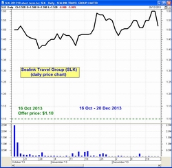
SLK - The first few weeks
(daily line chart) |
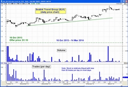
SLK - The first five
months
(daily candles + volume + trades)
This candlestick chart is over a 5 month period,
and some candles are simple doji candles suggesting that
trading is light on some days (ie. an illiquid stock).
The
bottom window pane in the price chart is the number of
trades each day. |
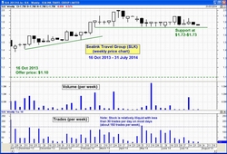
SLK - The first nine
months
(weekly candles + volume + trades)
The share price has been sitting above a support level for
weeks (at least from February to July 2014).
The weekly trades chart above continues to show this stock
is not liquid enough for many investors/traders.
|
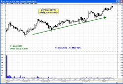
OzForex (OFX)
2017 - The company
re-branded from OzForex to OFX Group Limited https://www.ofx.com/en-au/
11 October 2013
Offer price: $2
See latest price chart at ASX.com.au.
Consistently trading well above the offer price, in a
nicely rising up trend, at least for the first
five months until March 2014.
Updated: 31 July 2014
|
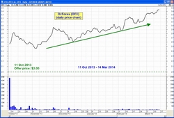
OFX - The first five
months
(daily line chart)
This daily line chart for the first 5 months clearly shows
the uptrend under way, taking the share price even higher
than the early trading prices (and above the issue price). |
OFX - The first five
months
(daily candles) |
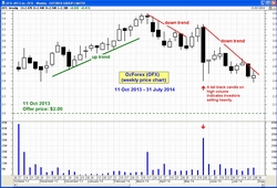
OFX - The first ten
months
(weekly candles)
Since the highs of March 2014, the stock has traded lower
in a consistent downtrend, except for the 2-week
retracement in May 2014, followed by a Big Black candle on heavy volume.
|
iSelect (ISU)
www.iselect.com.au
24 June 2013
Offer price: $1.85
First day - down 15.7 percent.
First two months - trending higher from day one but still
underwater.
After 5 months - strong down trend - loser.
|
ISU - The first two
months
(daily line chart) |
ISU - The first two
months
(daily candles) |
ISU - First 5 months
(weekly chart) |
Xero Limited (XRO)
www.xero.com/au/
Commenced trading on ASX:
8 November 2012
First day's close: $4.48
Has been listed on the NZX since June 2007.
|
XRO - The first two
months
(daily line chart) |
XRO - The first two
months
(daily candles) |
XRO - First 12 months
(weekly chart) |
Virtus Health (VRT)
June 2013
|
|
|
|
360 Cap ind fund (TIX)
December 2012
|
|
|
|
QR
National
(QRN)
December 2012 rebranded to: Aurizon (AZJ)
www.aurizon.com.au
22 November 2010
Offer price: $2.55
Touted at the time as Australia's biggest float in more
than a decade (BusinessDay).
More detail: Wikipedia.
|
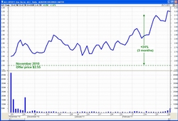
AZJ (QRN) - The first
three months
(daily line chart) |
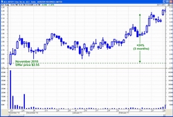
AZJ (QRN) - The first
three months
(daily candles) |
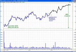
AZJ - First 3 years
(weekly chart) |
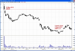
Facebook
(FB)
18 May 2012
www.facebook.com
Offer price: US$38
This float was highly anticipated, and many people felt
like they needed to participate. This stock was under
water for 14 months. Capital invested elsewhere could have
made some good returns.
|
Facebook - The first five
weeks
(daily line chart) |
Facebook - The first four
months
(daily candles) |
Facebook - 19 months
(daily chart) |
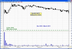
NextDC
(NXT)
13 Dec 2010
www.nextdc.com
Offer price: $1.00
|
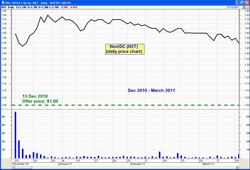
NextDC - The first 3
months
(daily line chart)
Traded consistently above the offer price. |
NextDC -
The first 3
months
(daily candles) |
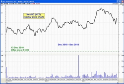
NextDC -
3 years
(weekly chart)
Traded consistently above the offer price. |
Myer (MYR)
www.myer.com.au
2 November 2009
Offer price: $4.10
First day: Open: $3.88, Close: $3.75
|
MYR - The first three
months
(daily line chart) |
MYR - The first three
months
(daily candles) |
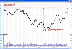
MYR - First 4 years
(weekly chart) |
BrisConnections (BCS)
www.brisconnections.com.au
July 2008 - For listing details, see the notes under each
chart at right.
Notes for the charts:
(a) Logarithmic price scale makes it
easier to see the price action details
at lower prices.
(b) Volume is low (or zero) on many days.
(c) Number of trades per day is very low
(or zero) on many days.
Items (b) and (c) indicate low liquidity,
and difficult to exit if desired.
Also see opinion comment, and more information
at Wikipedia.org.
|
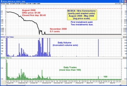
BCSCA - August 2008 - May
2009
(daily line chart)
Listed:- 31 July 2008
(code:BCSCA)
Initial instalment: $1
with two further $1 instalments owing.
First day - fell 60 percent.
November 2008 - shares had fallen
to 0.1cents. Trading continued
occasionally at very low volumes.
|
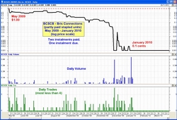
BCSCB - May 2009 -
January 2010
(daily line chart)
May 2009
(code:BCSCB)
Second instalment paid ($1),
taking the paid-up cost to $2 per share,
with trading on 7 May 2009 to a
daily low of 51cents and closing at $1.
13 Jan 2010 -
Trading suspended pending
payment of the third and final $1
instalment, taking the fully paid-up
cost to $3.
|
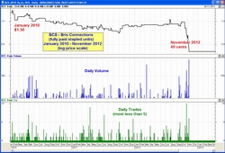
BCS - January 2010 -
November 2012
(daily line chart)
Friday 15 January 2010
(code:BCS)
Trading in fully paid securities started,
with one trade for the day at $1.30.
13 Nov 2012 - Shares
suspended
from trading.
|
Asciano (AIO)
www.asciano.com.au
6 June 2007 - Demerged from Toll Holdings.
Stock debut: $10.35
Note: Subsequent share issues, raising, dilutions, etc.,
result in the historic share price being corrected,
to show historic prices that don't appear to relate to the
original raisings.
|
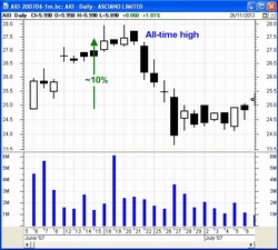
AIO - The first five
weeks
(daily candle chart)
Note: Nice 10 percent increase in the
first two weeks to an all-time high,
and then just down from there. |
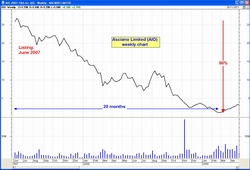
AIO - The first 20 months
(weekly line chart)
Note: From the all-time high just after
listing, it was all down hill for 20 months
to an all-time low. A fall of 96 percent. |
AIO - The first 6 years
(weekly line chart)
Note: Since the all-time low in February-
March 2009, the share price first
rose for a while, and then has traded
mostly sideways ever since.
|
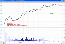
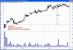
Boart Longyear (BLY)
www.boartlongyear.com
5 April 2007
Offer price: $1.85
(Said to be the second largest IPO in the history of the
ASX - Source: Wikipedia).
May 2010 - Share consolidation (one for 10), increased the
nominal share price, and back-adjusted the IPO price up to
$15.
|
BLY - The first three
months
(daily line chart) |
BLY - The first three
months
(daily candles) |
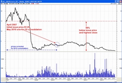
BLY - The first 6 years
(weekly chart)
Note: This chart should be drawn with
a logarithmic price scale for a
better depiction of price action. |
WDS Limited (WDS)
2006
|
|
|
|
AMP Limited (AMP)
www.amp.com.au (About AMP)
15 June 1998 - demutualised.
12 December 2003 - demerged.
|
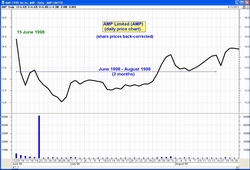
AMP - The first 2 months
(daily line chart)
Note: Share prices have been
back-corrected due to the
2003 demerger (and possibly other
capital reconstructions). |
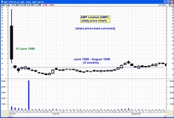
AMP - The first 2 months
(daily line chart)
Note: Share prices have been
back-corrected due to the
2003 demerger (and possibly other
capital reconstructions). |
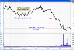
AMP - The first 5 years
(weekly
line chart)
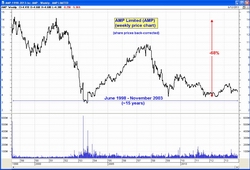
AMP - From
demutualisation
to November 2013
About 15 years
(weekly line chart)
|
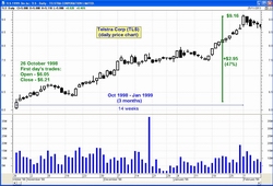
Telstra Corporation (TLS)
www.telstra.com.au
T1 - 1997 (the offer document)
Offer price $3.30 (max price in two instalments)
T2 - 1999 (the offer document)
Offer price $7.40
T3 - 2006 (the offer document)
Offer price $3.60
More details about the prospectus offer documents at www.telstra.com.au
Highlights:
- Float 1998
- Rising share price initially, then a long term
downtrend.
- Downtrend until November 2010 with two more public
offerings along the way.
|
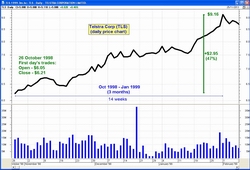
TLS - The first 3 months
(daily line chart) |
TLS - The first 3 months
(daily line chart) |
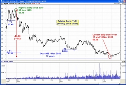
TLS - From it's peak in
1999
to it's lowest close in
2010
(weekly line chart)

TLS - From it's peak in
1999
to November 2013 showing
a rising price since Nov 2010
(weekly line chart)
|


")


")


