 |
Australian Share Market
BEAR Markets and
|
|
| Why
study past bear markets and corrections? We can protect our investment capital from the ravages of a bear market. A bear market or correction comes around about every 3 years on average. And they take more than 3 years (on average) to make new sustained highs! It is very useful to be aware of this, and don't be surprised when it happens again! How can you see a bear market coming? - It's all in the price charts. What is the difference between a bear market and a correction? (see below) |
How
can we spot the Bear
Markets and Corrections on the chart?
How do they unfold?
How bad are they? How much does the market fall?
How long do they last?
One of the tools in Brainy's Share Market Toolbox.
The weekly price charts below show the Australian bear markets and corrections from 1987. Latest update:- 4 March 2016.
See
Bear Market Twins details below.
Aussie
BULL Markets information is also freely available in the
public
area of the Share
Market Toolbox.
Related (public) links: Australian share market BULL Markets; Bear Market Twins;
Related links (for Toolbox Members): Australian share market BULL Markets; Australian share market BEAR Markets;
the charts below
The charts and comments below are purely observations of the market. They are of a general nature, and for general education only.
 There is
no advice.
It is recommended that you do NOT make any investment decisions based on any of the information here.
a larger view in a new window.
| Robert would
like to keep you informed of new
information as it becomes available, and as updates are made
here. So consider registering to receive updated
news and
information. Toolbox Members can see detailed comments about the charts below, in the Members Area of Brainy's Share Market Toolbox web site. |
For Email
Marketing you can trust
|
which is an aggregation of the "top" 500 companies in the Australian market.
The charts below are produced using the Australian BullCharts charting software.
Be careful when comparing the numbers - such as the closing price, or amount of fall or rise,
because a daily price chart will show somewhat different values to the weekly price chart.
Since the latest charts and update below in 2016, the Australian market has rallied since the fall of 18.9 percent indicated below.
The table at right is a summary of the bear markets (falls greater than 20%) and corrections (falls of between 10% and 20%).
The "Amt (%)" is the percentage fall from the recent high to the market low (based on weekly Closing prices, not on Highest Highs).
"Weeks to bottom" column. The shortest bear market listed was 21 weeks (nearly 6 months). Unless you count the Correction K (in late 1997) which hit bottom after just 5 weeks, and then recovered only to retest the bottom at 50 weeks from the start.
"Time to recover to past high" (the last column) is the amount of time that elapsed before the market recovered to sustain a new High. NOTE the average value at the bottom of the table.
Toolbox Members can see detailed comments and more charts in the Toolbox Members Area.
| Bear Markets and Corrections — 1987 to 2016
(updated 4 March 2016) |
||||||
| Start Date | From Point | Bear Market or Correction | Amt (%) | Weeks to bottom | Time to recover to past high | |
| Weeks | Years | |||||
| Sept 1987 | A | Bear market | -48 | 21 | 440 | 8.5 |
| Aug 1988 | C | Correction | -14 | 34 | 238 | 4.6 |
| Oct 1989 | E | Bear market | -30 | 65 | 194 | 3.7 |
| Nov 1991 | G | Correction | -19 | 53 | 85 | 1.6 |
| Jan 1994 | I | Bear market | -21 | 53 | 150 | 2.9 |
| Sept 1997 | K | Correction | -11 | 5 or 50 | 66 | 1.3 |
| June 2001 | O | Correction | -16 | 12 | 152 | 2.9 |
| Mar 2002 | Q | Bear market | -21 | 52 | 116 | 2.2 |
| Oct 2007 * | S2 | Bear market | -54 | 73 | 366+ | 7+ |
| Apr 2010 | U | Correction | -15 | 75 | 170 | 3.3 |
| Apr 2011 | U2 | Bear Market | -21 | 24 | 99 | 1.9 |
| Apr 2012 | U3 | Correction | -8.5 | 4.5 | 29 | 0.6 |
| May 2013 | U4 | Correction | -9 | 6 | 39 | 0.8 |
| Apr 2015 ** | U5 | Bear Market | -18.9 | 41 | (tba) | (tba) |
| Average time to make new highs: | 3.1 years | |||||
|
Notes:-
* The last big Bear Market (the GFC of 2007+) has not yet recovered to new highs. ** The Bear Market that started with a peak in April 2015 was indeed a bear market for the XJO index (having fallen at least 20 percent); but the All Ords index (XAO) fell just less than 20 percent so, technically, was not a bear market. |
||||||
Note:
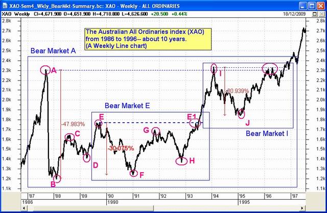
- Within the Bear Market "A" there was a correction labeled "C", another Bear Market "E", and yet another labeled Bear Market "I".
- It could be argued that the Bear Market that started at "A" can be discounted because the bull market peak at "A" could be passed off as an aberration. If we ignore the peak at "A", then the Bear Markets labeled "E" and "I" don't seem so bad. But this would ignore the realities of the damaged investor portfolios.
For more detail and comment about each of these bear market periods, see the Members Area of Brainy's Share Market Toolbox.
Note:
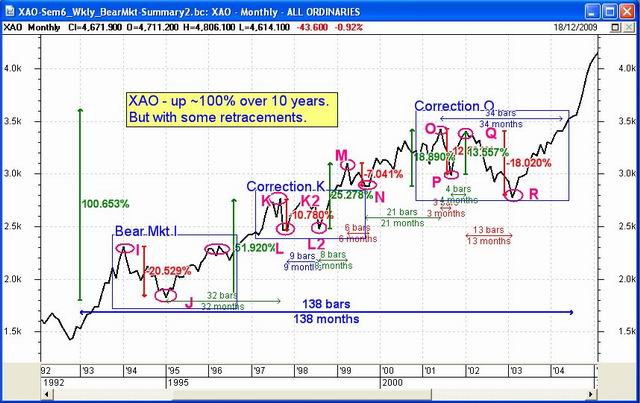
- Bear Mkt "I" is already shown in the previous chart above.
- From the peak at point "K", the market fell to "L", then recovered to K2 before falling again to L2. The fall of only about 10% qualifies only as a "correction"; but it took place over a 9 month period.
- You can see at a glance that the market took about 14 months from point "K" to recover back up to this level. That is, the market went no where for 14 months.
- The market repeated the behaviour from point "K" to "M" in the period from point "O" to the low at "R" before moving higher. Except this time the market took about 34 months to recover to the same level as point "O" in April 2004.
For more detail and comment about each of these bear market periods, see the Members Area of Brainy's ShMarket Toolbox.
See more details in the Members Area of the Share Market Toolbox.
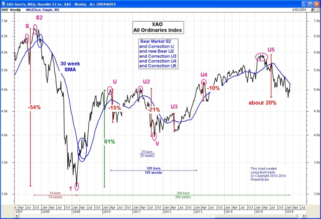
- The bull market that started in 2003 (not shown on this chart) ended in late 2007 at point "S", from where the market fell more than 10% before recovering to a new high at "S2". (See Bull Market "R" on the Summary Chart, or a more detailed version of this 4-year bull market in the Members' Area.)
- The bear market labelled "S2" in the table above commenced at point "S2" on the weekly chart at right. The dip between points S and S2 is not so apparent on a monthly chart.
- The market fell about 53% from S2 to point "T" (a Tower Bottom candle pattern) over 16 months, then rose 61% to point "U".
- Even though Bear Market "S2" might technically have finished, we are still waiting to see new highs. That is, we have not yet fully recovered from the effects of Bear "S2". The rise from point "T" can be classified as a bull market.
- See more details about Bull Market "T" in the public area, or in the Toolbox Member's Area.
- The index then fell 15% from point "U" to make a new Correction, then recovered to the same highs at point "U2" making two attempts to move higher, but then fell 21% to point "V", resulting in another bear market (a fall of more than 20%). See details in the Toolbox Members Area.
- In April 2015 the index formed a top (at "U5"), with multiple failed attempts to push higher. It then fell about 20 percent in the following 41 weeks. As stated above in the notes, the XJO index fell a little more than 20 percent, while the All Ordinaries index (XAO) fell a little less than 20 percent.
For more detail and comment about each of these bear market periods, see the Members Area of Brainy's Share Market Toolbox.
This chart updated 4 March 2016.
See the latest version of this chart, and more details in the
Members Area of the Share Market Toolbox.
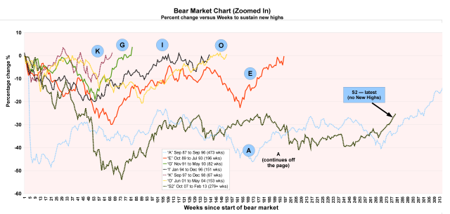
Each line on the chart starts at "Week zero" and "0%". The chart shows how each bear market developed over time, with the price falling away week by week.
All these bear markets and corrections have fallen and then returned to make new highs.
Except for the latest bear market "S2" which at the time of preparing this material had not made a new (and sustained) High.
For example, the Correction labelled "K" fell away from the horizontal zero line in the first few weeks, then made new highs after about 33 odd weeks only to fall again to about 10% down before making sustained new highs after about 66 weeks.
Note that Bear Market "A" continued for so long that it runs off the edge of this chart.
for a larger image.
See more details in the Members Area of the
Share Market Toolbox.
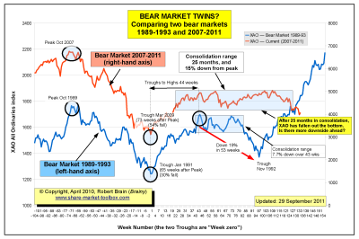
In his normal weekly market analysis in April 2010, Robert realised that the bear market that started in late 2007 (see chart 2007-2012 above) was unfolding with a very similar shape to the bear market of 1989-1993 (labelled "Bear Market E" in the chart of 1987-1996 above, or see a close-up and detailed version in the Members' Area).
The chart at right shows that old bear market superimposed onto the more recent bear market. The time scale is the same on both. The two charts have been offset sideways so that the trough of each market coincides.
and the latest up-to-date details,
including some percentage amounts, and precise time counts,
see the Bear Markets analysis in the Toolbox Members' Area.
at right for a larger image.
See the latest up-to-date version of this chart in the
Toolbox Members Area.
| How is any of this useful? | |
| Firstly, whatever has happened in the market in the past is possible at any time, and could happen again. So we should not be surprised if our market was to take another tumble below the levels of early 2010. It did this in 1992 (falling 19% from recent highs) before the market recovered from the crash of 1989, and it could happen again. | Secondly, some people like to study "cycles" on charts. That is, they look for roughly constant repetitions. Things like the number of weeks from a Peak to a Trough, or a Peak to a Peak. And the numbers 44 and 90 and 144 are amongst a few popular numbers. It is a case of view a chart (with good software), and take some measurements, and look for patterns. |
- The market can move a long way very quickly; but once a bear market starts, it can run for several months.
- On a Weekly chart, a bear market bottom is often a "V" shape.
- A bear market does often form a "W" pattern on the chart.
- More detailed conclusions are listed in the Members Area of the Toolbox.
Bear market and correction - definitions.
- A bear market is a fall of more than 20 percent.
- A correction is a fall of between 10 and 20 percent.
More details about the Bear Markets and Corrections above
is available from the Members Area of Brainy's Share Market Toolbox.
