 |
Australian
Share MarketBULL Markets 1988-2018 |
|
| Why study past
bull markets? It is very useful to be aware of the characteristics of past bull markets. How did they start? - with a whimper? or by surprise? How long did they last? How did they end? - Not without warning! How can we tell? - It's all in the price charts. |
||
|
One of the tools in Brainy's Share Market Toolbox.
The charts below show the Australian bull markets from 1988. Last update:- November 2018.
Aussie Bear Markets and Corrections information is also available.
Related (public) links: Australian share market BEAR Markets; Bear Market Twins;
Related links (for Toolbox Members): Australian share market BULL Markets; Australian share market BEAR Markets;
to sections below
- Summary Table - 1988 - 2018.
- Summary Chart 1 - 1988 - 1994.
- Summary Chart 2 - 1991 - 2009.
- Later charts beyond 2011.
- Comparison Price Chart.
- Conclusions
- This analysis is based on Weekly charts of the Australian All Ordinaries (XAO) index.
- Bull Market start? - How do we know when a
Bull Market has started? Well, there is no
prescriptive definition. The best we can do is eyeball the chart. (See Wikipedia for a comment.) - Bull Market end? - How do we know when a Bull
Market has ended? For the analysis here,
as soon as there is a fall of 10% or more (the Close on a Weekly chart), the bull market
is declared over. - Line charts - Mostly line charts are used
below (not candle charts)
to keep the chart relatively simple. These still demonstrate most of the key points. - Daily
or weekly? - It is perhaps more useful to use daily
charts for this analysis, because
the daily close prices are very important (more important than weekly close prices).
However, over the longer time periods the daily line chart can get a little messy. - Candlestick
charts - It is likely that candlestick
charts would contribute more to the analysis,
but would potentially complicate the discussion.
the charts below
The charts and comments below are purely observations of the market. They are of a general nature, and for general education only.
 There is no advice.
It is recommended that you do NOT make any investment decisions based on any of the information here.
a larger view in a new window.
| Robert would like to keep
you informed of new information as it becomes available,
and as updates are made here. So consider
registering to receive updated news and information. Toolbox Members can see detailed comments about the charts below, in the Members Area of Brainy's Share Market Toolbox web site. |
For Email
Marketing you can trust
|
which is an aggregation of the "top" 500 companies in the Australian market.
(What does "top" mean? See details about Aussie indexes.)
The charts below are produced using the Australian BullCharts charting software.
The table at right is a summary list
of the bull markets.
How do we identify the start and end of a bull market? For this exercise, we have eyeballed the price chart, and made a judgement call about the start of the bull market period at a significant market low. And the bull market has ended at the last High before a decline of at least 10%.
The "Amt (%)" is the percentage rise from the recent market Low to the last High.
The column "Duration...Yrs". The shortest bull market listed was 6 months and the longest was almost 4½ years.
| Bull Markets 1988 to 2018 (updated 2 November 2018) |
||||||
| Start
Date |
From Point |
Bull Market? |
Amt (%) |
Duration | Ave Amt pa (%) | |
| Wks | Yrs | |||||
| Feb 1988 | B | Bull Market | 37 | 25 | 0.5 | 77.0 |
| Apr 1989 | D | Bull Market | 25 | 26 | 0.5 | 50.0 |
| Dec 1990 | F | Bull Market | 37 | 43 | 0.8 | 44.7 |
| Nov 1992 | H | Bull Market | 70 | 64 | 1.2 | 56.9 |
| Jan 1995 | J | Bull Market | 50 | 137 | 2.6 | 19.0 |
| Aug 1998 | L2 | Bull Market | 39 | 146 | 2.8 | 13.9 |
| Feb 2003 | R | Bull Market | 138 | 228 | 4.4 | 31.5 |
| Mar 2009 | T | Bull Market | 61 | 58 | 1.1 | 54.7 |
| Sep 2011 | V | Bull Market | 30 | 85 | 1.6 | 18.7 |
| Jun 2013 | W | Bull Market | 28.5 | 95 | 1.8 | 15.6 |
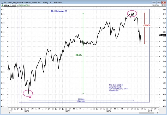
| Feb 2016 | X | Bull Market | 33.5 | 133 | 2.6 | 13.1 |
See some more detail about these bull markets in the information below,
and Share Market Toolbox Members can see more detail
in the Members Area of Brainy's Share Market Toolbox.
For more detail and comment about each of these bull market periods, see the Members Area of Brainy's Share Market Toolbox.
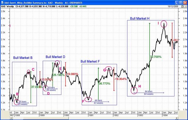
Note:
- This chart is drawn with a log scale on the vertical value axis. Why? Hint: Note the relative size of each bull market rise.
- More comment on this is in the Members Area.
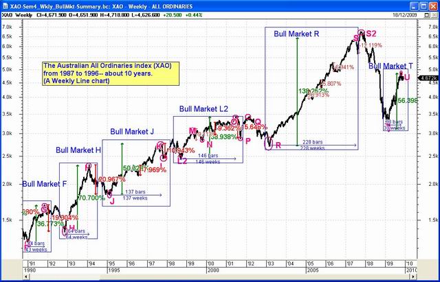
Note:
- It can be argued that a bull market started at the last market low in March 2009.
- By late April 2010 the XAO index had risen 61% over 59 weeks, including some significant range trading (sideways movement) for 36 weeks (enclosed by the red rectangle).
Finished - May 2013
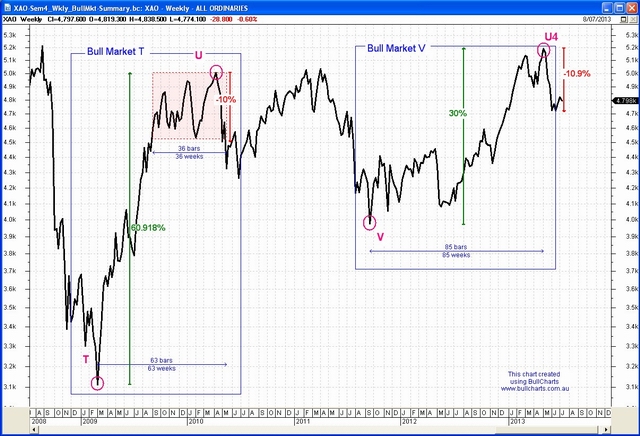
The chart at right shows the Bull Market "V" in the left half of the chart, and Bull Market "W" from June 2013. The index then fell more than 10 percent from the peak in April 2015 (the chart is about to be updated).
For more detail and comment about each of these bull market periods, see the Members Area of Brainy's Share Market Toolbox.
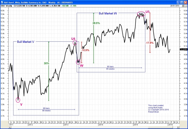
The chart at right shows the Bull Market "X" which started in February 2016 and ran for more than 2 years before a market correction hit.
for a larger image.)
(Toolbox Members can click on the chart for a larger image.)
There has not been another bull market period since this one.
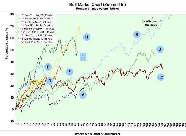
Each line on the chart starts at "Week zero" and "0%". The chart shows how each bull market developed over time, with the price rising week by week.
Note that Bull Market "R" continued for so long that it runs off the edge of this chart.
Bull Market "T" finished in May 2010.
For more detail and comment about each of these bull market periods, see the Members Area of Brainy's Share Market Toolbox.
for a larger image.
about the Bull Markets above is available
in the Members Area of
Brainy's Share Market Toolbox.
How did they start? - with a whimper? or by surprise?
How long did they last? How did they end? - Not without warning!
See more details in in the Members Area of the Toolbox.
- The market can move a long way very quickly; and once a bull market starts, it can run for several months.
- More detailed conclusions are listed in the Members Area of the Toolbox.
Aussie Bear Markets and Corrections information is available.
More details about the Bull Markets above is available from the Members Area of Brainy's Share Market Toolbox.

