|
Brainy's
Share Market Toolbox |
and the full May 2013 edition of the Investor Update newsletter here... (to be updated when published) You
are here: Share Market
Toolbox
> ASX Investor Update
> ASX
Investor Update May 2013 - more Info
Related links: Summary list of other ASX articles; About the Share Market; Robert's Philosophy; Share Market GEMs; Share-Market-Ready;Funda-Technical Analysis; Sensible Investing; Contrarian Investing Redefined; |
|||||||||||||
The May 2013 ASX Investor Update newsletterFor the published text of the May 2013 article that Robert authored, and the initial price charts, see the ASX article here... and the full edition of the May 2013 newsletter. Below is more information, and larger versions of the charts (click on the image for a larger version).Investing in the big banksMany investors consider investing in a bank, whether for dividend income or capital growth, but is now (May 2013) a good time? Or are the banks too expensive? And how can we protect our investment capital in case of a fall in share prices? Banks too expensive?Some Australian bank shares have been running hard in recent months (see the chart of CBA below). Are Australian bank shares too expensive? Are they just a yield play? Should we consider the banking sector as a whole? Should we compare one bank's share price with another and look for correlation and a possible pairs trade? Given the current markets and world economy should we be making assumptions about the possible future risk events that could impact the banks? What about the unknowns that are still loitering in the European crisis? What about earnings certainty? And the possibility of local bad debts increasing? Many of the successful technical analysts around the world pay little attention, if any, to fundamental data and the questions raised above, because they believe that everything is eventually reflected in the price chart. And what makes the share price move up and down on the chart is the range of opinions of fair value amongst all the market participants. Which begs the question how do you determine fair value? or the intrinsic value? Fair value?If you ask a hundred brokers and analysts what they believe is a fair price for the shares of, say, Commonwealth Bank, what do you think the answer will be? How many different answers will we get? Should we consider all their recommendations and take a statistical average price, or a median price? Why spend all that time reviewing company performance, and studying financial results, and making assumptions to derive numbers to go into a spreadsheet model? Is it really worth the time? Well, many retail investors do this because they enjoy the activity. It's like any other hobby, or enjoyable past-time. It is often argued by some market participants that there is no need to spend so much time on very detailed analyses. Because at the end of the day, the right number for the fair value is the closing price on the share market today. It is futile to argue against the market. Whatever the market tells us about a share price is very close to the truth except of course for those people with inside information and who might trade on this non-public knowledge. Fundamental analysis is usefulSome investors or traders believe that fundamental analysis is of little use but it can be very useful. A couple of key fundamental analysis metrics can help us to eliminate high-risk non-performing stocks from our watch list. By looking for a good consistent Return on Equity (ROE), we will be focusing on historically well performing companies. By ignoring stocks with a high Debt to Equity ratio we will eliminate the highly geared companies that are at risk of stress if credit funding gets tighter. And by looking for companies with a good PE Growth (PEG) ratio, we are relying on available analysis to determine the companies that are likely to perform well in coming months. So, fundamental analysis can be useful to identify quality stocks for our watch list, so that we can then focus on buying (and selling) stocks when the shorter term share price performance is optimal (using technical analysis). This approach is known as Funda-Technical Analysis. What about banking sector performance?When looking for investment candidates, is it useful to look at the performance of the sector? The underlying theory supporting the study and comparison of sector performance is that if a sector is declining, then there must be something in the economy that's working against the stocks in that sector. Otherwise the decline would be limited to just individual stocks. And the converse is true when a sector is rising, it suggests that most of the stocks in that sector must have a positive outlook that's caused by something in the general economy. The notion of sectors and sector indexes, and which stocks are in which sectors, is not discussed very much, and results in a lot of confusion and misunderstanding for investors. When looking at the banks and the banking sector, it is important to note a couple of important points. Firstly, stocks are allocated one of the ten universal GICS sector codes, so all the stocks in any one sector can be identified. Secondly, there are three sector indexes that might be relevant to studies of the banking stocks as follows:
[btw How to remember what the code is for each of these sector indexes? Well the sector indexes that are derived from the 200 stocks in the XJO all have a code with the first letter X, and the last letter J. The middle letter is basically the first letter from the sector name in most cases F for financial, P for property, T for telecommunications, etc.] See more information about share market indexes, and sectors. The accompanying chart shows the XXJ sector index since 2004. It clearly shows the market peak in late 2007, followed by the bear market crash through 2008, and mostly sideways ranging from late 2009 to 2012. This sector has broken to new 5-year highs in 2013. The
XXJ sector index
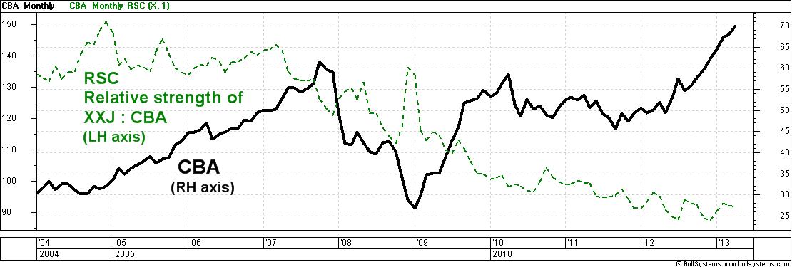
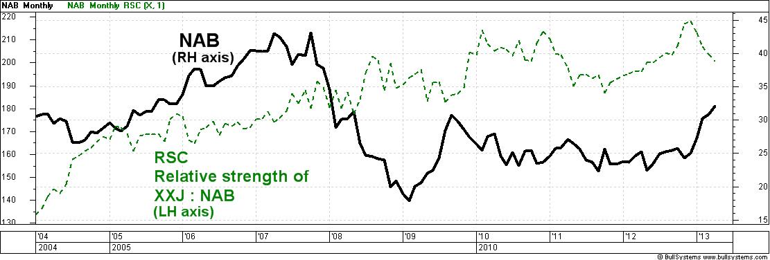
(click on the chart for a larger image) The big four banks have a combined market capitalisation today of about $360 billion, which represents about 78 percent of all the 20 stocks in the XXJ. This means that most of the time, the chart of the XXJ will probably look very similar to the chart of each of the big four banks. Or is it? The next chart below shows Commonwealth Bank (CBA - the thick black line) over the same time period as the chart above. Do a quick visual comparison of the XXJ above and CBA below. They both tend to peak and trough at about the same time. Many of the bumps along the two charts coincide. But, the key difference is the height of each peak, and in fact the relative height of one peak to another. Notice the peak in late 2009 and early 2010 CBA (below) almost reached it's highs of 2007, while the XXJ (above) peaked a long way below it's highs. Also, in April 2013 (the very end of the charts) CBA is clearly rising higher than it's 2007 peak while the XXJ above is still below it's 2007 high.  Commonwealth Bank (CBA) and relative strength (RSC) comparing to XXJ sector (click on the chart for a larger image) Eye-ball the chart of National Australia Bank (NAB) below, and note it's peaks and troughs. It is much more like the chart of the XXJ above, rather than the chart of CBA. Out of the big four banks, these two banks are the extremes in price variation.  National Australia Bank (NAB) and relative strength (RSC) comparing to XXJ sector (click on the chart for a larger image) But what about a real measure to compare them? The Relative Strength Comparison (RSC) is a chart tool to do exactly this, found in many charting software packages as a chart indicator. The last two charts above also show the RSC (dotted green line) which is comparing the share prices on the chart to the value of the XXJ sector index. In this case it is calculated by dividing the value of the XXJ by the company's share price. For example, in April 2013, the XXJ was about 6500 and NAB was about $32, and dividing 6500 by 32 results in the RSC value of 203 which can be seen on the last chart above (left hand axis). [In actual fact, the RSC shown here is the inverse of the RSC.] How to interpret this? Looking at the chart of NAB and the RSC, we can see that the RSC has risen across the chart over the nine years of the chart, suggesting that NAB has lagged more and more behind it's peers in the XXJ index. And for CBA? The RSC has fallen across the chart, especially in the last four years, indicating that CBA has been strongly outperforming it's peers in the XXJ. Is this useful? We might consider a mean reversion strategy and anticipate that CBA will eventually swing back towards the sector index, and that NAB will pick up and likewise swing towards the sector index. But in reality, these monthly charts covering several years indicate that if we had have adopted that approach just two years ago we would be out of the money today two years later. The devoted technical analyst who chooses to strongly follow the price charts with simple strategies might take the view that studying the related sector adds a level of complexity to investment decisions, without adding any value to the decision-making. They might simply adopt the adage the trend is your friend as the underlying principle for most of their decision making, and employ sound risk management principles. The trend is your friendThe chart of CBA above shows a clear uptrend of higher peaks and higher troughs since the trough in the third quarter of calendar 2011, some 19 months ago. In this time, CBA has increased 64 percent (annualised to 37 percent per annum). Over a similar period, even though NAB has underperformed it's peers, it has still increased about 50 percent. Mind you, though, even though NAB is up about 50%, it did most of this in 2009 and has moved sideways with no clear trend since then. See more information about trends. One of the six key tenets of Dow Theory basically says that a trend is a trend is a trend, until it is no longer a trend. Once a trend is in place, it is statistically likely to continue. The uptrend is over when we no longer see a higher peak and higher trough. If we were keen enough we could also view the weekly chart and use a 30week Moving Average, as advocated by Stan Weinstein in his infamous book Secrets for Profiting in Bull and Bear Markets. Sound risk management - the Stop LossIf
we
were invested in a bank today, and fearful that they are
overpriced, and wanting to protect our capital in case of a
sell-off,
we could implement a Stop
Loss strategy to cleverly take some money
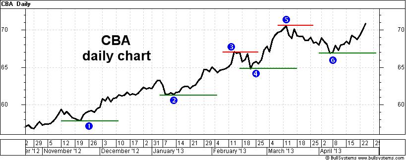
off the table. The daily chart shown here (as opposed to the weekly or monthly chart) of Commonwealth Bank (CBA) is important because it shows the price at which all market participants were happy to settle their positions over-night. On this chart we can see a series of higher peaks and higher troughs a confirmed uptrend over the last six months. It also shows short horizontal lines to indicate levels of price support, and resistance. The short lines drawn under the price are the support levels at the price troughs. They indicate progressively rising support levels, and price points where a Stop Loss value could be set. Notice that they are close to whole dollar values firstly at about $58, then $61, then $65, and $67. Also note that the line 3 at about $67 was a level of resistance. For several days in February, no one was convinced that CBA shares were worth more than $67, so there was a pause in the rising price, and a short sell off back to point 4 at $65. That resistance level at $67 later became a support level in early April (indicated at 6). This shows the switch in investor opinions regarding fair value at the $67 price point. If the price can clear the last peak at 5 where the daily close was $70.58, then it is likely to continue rising (but not guaranteed). And a Stop Loss could be placed a few cents below the last support level at 6 (the daily close was actually $66.93). If the price breaks below the latest support level, and hence our stop loss level, then the uptrend could be over, and we ought to sell to protect our capital in case a new downtrend is commencing. See more about Stop Loss strategy. ConclusionThe definitions for over priced and over valued are vague, not reliable, and can be distracting. The study of sectors might be useful, but can be time wasting, resulting in missed opportunities. It can be beneficial to simply follow the price trend on the chart and use sound risk management strategies including a stop loss. At the end of the day, does our own chosen approach seem sensible and protect our capital? More Information?Want to understand more about how to interpret the price charts? See the details in the right-hand column above... |
To
print this web page - in your browser select the printing
option "Shrink to fit". View larger versions of the charts below by clicking on the chart. More informationTo understand more about how to interpret the underlying mood and sentiment using the price charts:
Share
Market Terminology
See Brainy's eBook Articles, and the Master Index list for details. Or, search the eBook Articles. Robert Brain provides support to both new and experienced traders and investors. Who
is Robert Brain? 
The toolbox is an arsenal of weapons to help you tackle the share market. See a list of contents on the Toolbox Gateway page. The Share Market - more information about the market and investing and trading.  And whatever you do,
beware of the sharks in the ocean! |
||||||||||||
|
The information presented herein
represents the
opinions of the web page content owner, and ©
Copyright 2013, R.B.Brain -
Consulting (ABN: 52 791 744 975).
|
|||||||||||||


