Introduction
Don't forget that price charts capture and
summarise the underlying opinions and emotions of the market
participants. Every chart tells a story, and it pays to understand the
stories in the price charts.
The ideas of support and resistance
on a price chart are very important in the study of technical analysis.
It is best explained with reference to an example as in the
accompanying price chart below (click on the chart for a larger
version).
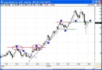
The accompanying chart is a monthly candlestick
chart of BHP
covering an eight year period from 2001 to 2009.

|
Figure 1
Support and
Resistance |
Remember that on a
monthly candlestick chart, each candle
summarises the price action in a
whole month. See more
information about candlestick charts.
On this chart, the red line at the horizontal price level labeled "1"
(at about $12) indicates a resistance level on the
chart. The price was stuck below this level over many months until it
broke above it in mid-2004.
Conversely, the green line at the horizontal price level labeled "2"
(at about $24) indicates a support level on the
chart. Once the price had moved above this level in late 2005,
it
came back down close to that level on several occasions in 2006, but
managed
to stay
above it. Hence this price level is referred to as price support.
What is resistance?
In simplistic terms, a resistance
level forms
and becomes apparent on a price chart because there is reluctance
amongst traders and investors (the market participants) to hold the
stock above the resistance
level. That is, they don't believe that it is worth any more than this
price. And it often tends to be a whole number of dollars (such as
$12.00).
On a price chart, a resistance
level on the chart appears to be a
ceiling for the price, where the price rises to the ceiling and then
falls away, as though the ceiling is a concrete barrier that is
preventing the price from rising (it's actually a mental barrier, or an
opinion regarding fair
value or intrinsic
value).
There are many reasons why the market sentiment might cause a price to
be stuck below a resistance level. One of them is simply a broad view
that the stock is not worth any more than that amount. In this case,
whenever the price rises "TA-101" close to an established resistance
level, many
traders will take profits in the belief that the price is about to fall
again.
In many cases, there comes a point where the sellers in the market who
have been selling the stock up to the resistance level have all gone.
Once this happens, the only sellers left are those who are prepared to
sell at prices above the
resistance
level, and the price can move up to above new level. Once this
situation seems to be confirmed, then more buyers will come into the
market, and even people who were selling in the past might now become
buyers to buy back into the stock while it is rising (they will be
afraid of missing out on higher prices - the emotions
of fear and greed
at play).
What is support?
A support level forms and
becomes apparent on a price chart because
there is general agreement amongst traders and investors (the market
participants) that a stock
is worth more than a particular price point - the specific support
level. On a price chart the support level appears to be a floor under
the price, such that as the price falls to this level, it then
rebounds up and away from that level.
As with resistance described above, there are many reasons why market
sentiment might cause a share price to remain above a specific price
level for a period of time.
Support and resistance case study
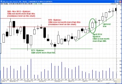
 The
price chart at right (click on it for a larger version) is a typical
classic example of price support and resistance levels. The
price chart at right (click on it for a larger version) is a typical
classic example of price support and resistance levels.
The majority opinion of the market participants is clearly that the
share price was not worth more than $78 to $80 over the period from
November 2013 to April 2014; but it was worth more than about $73.
A trendline is also support
A rising trend line
(as shown with the sloping dashed
line in the above sample price chart and labeled "5") also seems to
act as a floor under the price, and is considered a support line. As
the price rises, the rising trendline appears to act as a floor and the
price appears to bounce up off the support line.
Change in polarity
It is common for a specific resistance
level on a price
chart to eventually become a support level. This
happens because of the
psychology of the market participants, and simply reflects their
collective opinion and sentiment. That is, once the share price has
broken above a resistance
level, sentiment often switches so that the same level is then the
support level above which people will buy.
Fat pencil - a resistance 'zone'
When identifying and drawing a support or
resistance level on a price chart, it is sometimes useful to draw it
with a fat pencil. For a price chart of a company, the sentiment and
opinions of the market participants are often flagged at precise price
points. However, especially on a chart of a market index, the support
or resistance level can actually be a wider zone on the chart. In this
case, it is appropriate to draw the support or resistance level with a
'fat pencil'.
Past levels become future levels
One phenomenon that is often observed is that a
support or resistance level in the past will also be a support or
resistance level in the future. In some cases this is due to the
psychological impact that a number of investors had bought at the
previous level, only to see the price fall away. Their desire is to
recoup their losses by simply selling the next time the price reaches
the same level. So, when the price rises again to that level, they will
all be queuing up to sell, and this selling pressure can be enough to
stop the price rise.
Chart patterns
Many chart patterns such as triangles,
pennants, wedges, flags, double tops and bottoms, and so on, all have
price ranges on the chart where a straight line can be drawn across the
chart as either a support line, or a resistance line. In some chart
patterns there is one of each type that envelopes the price action.
Which charts? daily, weekly, monthly?
And shares, commodities, currencies?
When looking for levels of support and
resistance, should we be viewing daily charts? or weekly? or what?
Well, these observations apply to price charts of any period and any
financial market. That is, they apply to share prices, CFDs,
commodities, currencies, etc., and they will apply to daily, weekly,
monthly, quarterly, yearly charts. And they will also apply to
intra-day charts (eg. hourly charts, 30-minute charts, 10-minute
charts, etc.). Because of the underlying concept regarding the opinions
of the market participants, it applies across all
these variations.
However! You might find that the most accurate placement of a support
or resistance line is done on daily charts, using the body of the
candle to assist with line placement. This is because the most
important price each day is the closing price, which is that value
where the professional traders are happy to lock into a price for the
overnight non-trading period. On a weekly and monthly chart, the daily
close prices are not shown. "TA-101"
How is all this useful?
Price charts capture and
summarise the
underlying opinions of the
market participants (the
opinion regarding fair
value for the stock)
Once we understand the notion of support
and resistance levels on a price chart we can go
hunting for them, and draw them on the chart, and project them
forward in time. At some point in time they might fail; but in the
meantime they do provide a good indication of likely price action. One
good application is to apply a Stop
Loss just below a recent support
level. Price will normally be expected to bounce off a support level,
but if it happens to fall through it, then the price might continue
falling so we should look at exiting a position.
More information?
For more details about support and resistance,
and how to utilise these ideas,
see the More
Information
links which point to information in the Share Market Toolbox
at the top of the column at right.
|


