Introduction
The day-to-day and
week-to-week
performance of companies in the share market depends on the
underlying mood and sentiment of all the investors and traders
who
participate in the market. And this sentiment may, of course, be
influenced by fundamental data. When a company's share price
rockets
upward, or dives downward, it is because enough of the market
participants have a strong enough view of the stock, or of the
market
generally, to cause the share price to move.
The underlying
sentiment of market
participants is reflected in the share price charts, and in the
volume bars on the chart, and in the relative height of candlesticks
on a candle chart, and the presence and length of tails on the
individual candlesticks. And successive days or weeks of price
movement can form patterns on the chart which also reflect the
underlying market sentiment.
It is the emotions
of fear, greed and
hope which drive share prices (in addition to fundamental
data), all
of which are reflected in the price charts. The
field of Technical
Analysis is the study and interpretation of the
price action of financial instruments and the statistical
prediction of future behaviour. In Technical Analysis there is
a
substantial body of knowledge ranging from price charts
(described
here) to complex mathematical and computer studies. In
the
case studies below we look at the key concepts of trends,
support/resistance,
and the capital protection tool known as
the Stop
Loss.
Trends
A company's share
price fluctuates up
and down as people's views change from a perspective of
over-sold
(i.e. cheap) to over-bought (i.e. expensive). Over time, we
would all
like the share price to tend to rise, resulting in an increase
in our
investment capital.
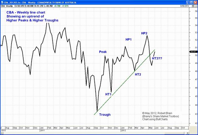
The concept of a trend
is a very
important principle in this regard. An uptrend is
defined on
the price chart as a series of higher peaks and higher troughs,
and
once a rising trend is in place, it is considered to remain
until it
is confirmed to have finished. Hence the saying the trend
is
your friend. Once a trend is established, the statistical
probability of it continuing is well proven.
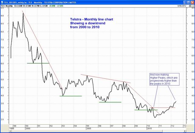
Conversely, a downtrend
is a
series of lower peaks and lower troughs on the price chart, and
is
considered to be in place until it is confirmed to have
finished. So
we should not be buying a stock while the share price is in a
downtrend often this would be buying on hope rather than
evidence. Those with some wisdom might tell us to buy a stock
while
it is cheap; but we need to understand that it might get even
cheaper. There were many examples of this in 2008.
Read
more about trends...
Stop Loss
The principle of the Stop
Loss
is that we identify a price level on the chart below which we
believe
the stock should not trade, or below which our loss will be more
than
we want to bear. If the stock does trade below this level, then
we
should sell the stock to limit any losses, lock in any profit
that we
might have earned, and to preserve our investment capital.
One precaution that
we should take is
to set our Stop Loss a little bit below the obvious Stop Loss
level.
Many investors might choose the same price level for their Stop,
in
which case we should have our own Stop a few cents further down.
Sometimes the price can spike low during the day or week to take
out
the obvious Stop Loss positions, and then return to a rising
trend.
How do we determine
where to place our
Stop Loss level? Within Technical Analysis theory there are many
approaches for this, with only one simple approach described in
the
text below.
Read
more about stop
loss...
The June 2012 ASX Investor
Update
For the text of the article, and initial price charts, see the ASX article here...
Also see (and download) a PDF
version
of the original contributed material here...
And larger versions of the charts are included below.
The Investor
Update charts
Commonwealth Bank (CBA)
Commonwealth Bank
weekly line chart - September 2011 to 2012
(click on the chart for a larger image)
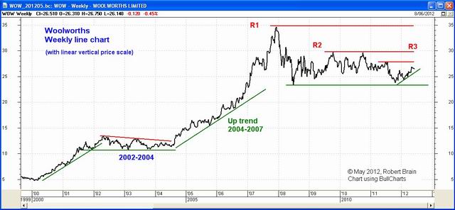
Woolworths (WOW) (with regular linear price scale)

Woolworths weekly line chart - 2000 to 2012
(click on the chart for a larger image)
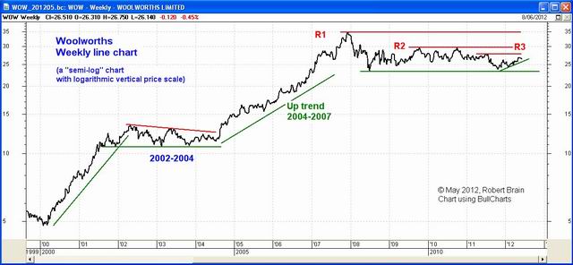
COMMENT: Notice the key difference between the above chart of
Woolworths, and the one below.
The upper one uses the conventional linear vertical price scale,
while
the lower one uses a logarithmic vertical price scale (hence
the lower chart is a semi-log chart). The semi-log chart can be
better
as it better indicates the percentage changes in price over time.
With
the linear scale above, the price jump in late 2007 seems to be
rather
over-done; but in the log version below we can see that the
percentage
change in price is only about twice that of the earlier moves
(perhaps
still over done?).
Woolworths (WOW) (with logarithmic price scale)

Woolworths weekly line chart - 2000 to 2012
(click on the chart for a larger image)
Telstra Corporation (TLS)

Telstra monthly
line chart - 2000 to 2012
(click on the chart for a larger image)

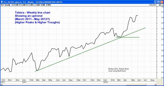
Telstra weekly
line chart - 2011 to 2012
(click on the chart for a larger image)
Qantas (QAN)

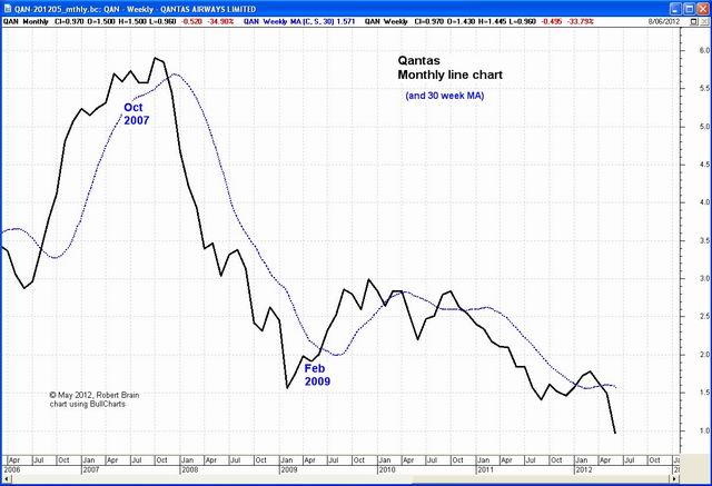
Qantas monthly
line chart - 2006 to 2012
(click on the chart for a larger image)

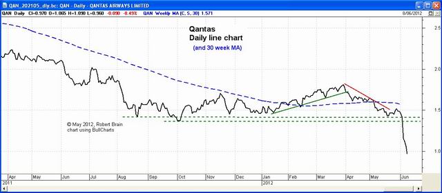
Qantas daily
line chart - 2011 to 2012
(click on the chart for a larger image)
More Information?
Want to understand more about how to interpret the price charts? See the details at top right...
|


