Introduction
Since the GFC (2008+)
many investors have come around to seeing that there is some merit in
utilising technical
analysis; but perhaps they struggle with understanding how to
make
a start. The information below works through some of the basics of
technical analysis, and some simple implementations. But first we
consider why this is so vitally important.
Why is this important and useful?
Firstly, it is
important to understand that:
Price charts summarise the
underlying opinions and emotions of the market participants.
Every chart tells a
story. It
pays to
understand the stories in the price charts.
This is important
because if a company's share price is tending to rise over time (an uptrend), it tells
us that there is an imbalance of supply and demand. That is, there is a
greater demand for the shares than there is supply. For anything, when
there is enough demand, the potential purchasers will try to outbid
each other in order to secure a purchase. In bull market conditions,
many stocks experience greater demand than supply, and so the share
price rises. And this is captured in the price chart. The price chart
has a story to tell us, and this can be very useful if only we know how
to interpret the stories in the charts.
Therefore,
at the simplest level we can find a stock with a share price in an
uptrend, and we can buy a position and join the trend. Then when the
uptrend is ending, we can sell the position to lock in profits and
protect our capital from any possible downside. In the material below
we look at the concept of a share price trend, and look at the
idea of a Stop
Loss and Exit
Strategies.
However, as we
proceed here, it is important to clearly state that we will usually
miss the very start of a trend, and the very end. So we should not go
looking for a turning point in anticipation of a possible uptrend -
this is wishful thinking and speculation.
Step 1 - Find stocks in a rising price trend
The first challenge for
everyone in this game is to find a good investment candidate. One
approach is
to find a
stock in a rising trend, and to join the trend. This is because the
experts say
that the "trend is your
friend". The only problem is that not every uptrend is
going to be profitable. So we need to have a plan to close a position
that is turning against us - an Exit Strategy.
However, being able to find an uptrending stock is very handy, and
there are many ways to do that.
About price trends on the charts
The first notion to understand is the idea of a price
trend - both the uptrend
and the downtrend.
This is important because once a trend
is confirmed to exist, then it
is likely to continue. This is because of the way the markets work, and
the
ways in which market participants take part in the buying and selling
process in the markets. It's also
to do with the investing/ trading emotion
and psychology.
How to
identify an uptrend or downtrend? - There are several ways
to do this. Some people suggest that in basic terms, if the share price
runs across the chart from the bottom left corner to the top right
corner, then an uptrend must have been in place. However, a
key approach used by technical analysts that is both precise and fairly
simple is described in the following paragraphs.
Uptrend
- Look at a simple line chart of a stock (like the sample shown at
right). It could be a daily* chart, or a weekly* chart, or in fact any
time period. On the price chart, an uptrend
is defined as a
series of Higher Peaks and Higher Troughs. To do this in practise,
first identify a peak on the chart, and then look to the right for a
higher peak. Likewise, identify a trough after the first peak, and look
for a higher trough (note: it does not matter whether the first peak is
before or after the first trough, because the important point is to
identify the next peak and trough). A downtrend is
defined
as a series of Lower Peaks and Lower Troughs.
Once an uptrend is in place, it is likely to
continue. That means that if we identify a stock with a share price in
a rising trend (an uptrend), then we could buy into the stock and it is
likely to continue rising (not guaranteed to keep rising, but is
likely to continue rising). If it just happens that the uptrend is
about to end, then we need to implement our exit strategy without delay.
Beware! -
Trends don't last forever
- It is important to understand that a price trend will not last
forever. So at some point it might be very appropriate to reduce a
position, or even sell out of
the stock completely. It is very important to be clear about the
conditions that
might trigger a sell decision - an Exit
Strategy.
Before we enter a position, we do have to be clear about the exit -
more details below.
|
|

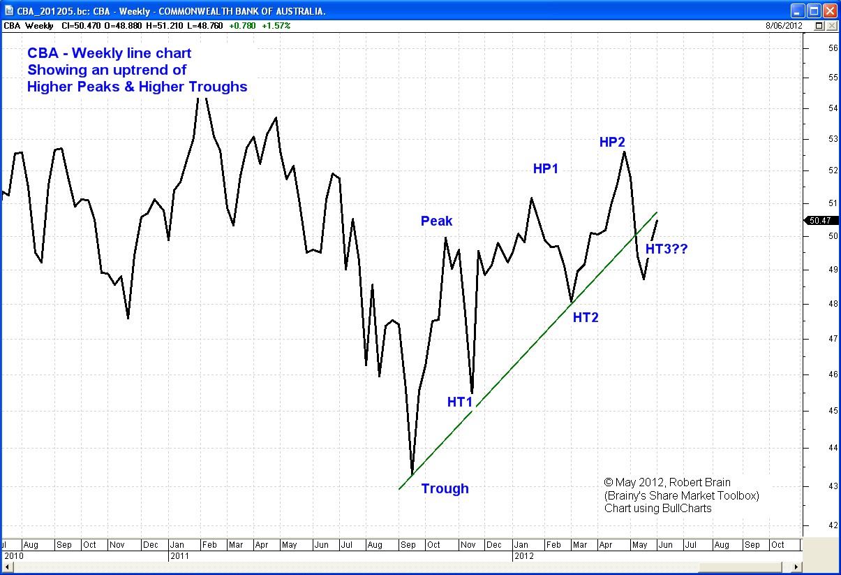
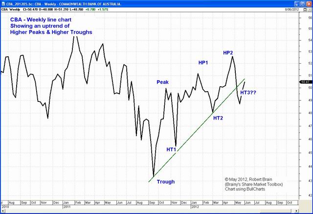
An uptrend
- A sequence of
Higher Peaks (HP) and Higher Troughs (HT)
(click on the image for a larger version)
* About daily
and weekly price charts.
A daily price chart (like the sample above) shows
the close price at the end of every trading day,
all joined together with short straight-line
segments. It is normal to only show the trading
days - normally Monday to Friday each
week, and with public holidays not shown.
A weekly price
chart shows the close price at the
end of each week, all joined together with short
straight line segments. A monthly price chart is likewise. And none of
these show any detail about
the range in share price during the period (during
the day, week or month).
A candlestick
chart shows the range in price during
each period - during each day, or week, or month.
See some
deatisl about candlestick charts.
|
Example uptrend -
The chart at right is a weekly line chart of Commonwealth Bank (CBA)
showing a Trough in September 2011, followed by a Peak in October, then
a series of Higher Peaks (HP) and Higher Troughs (HT). The green line
sitting under the price is the uptrend
line, with all price action sitting above
the line to confirm the uptrend. However, the share price fell below
this line in April 2012 indicating that the uptrend had finished.
[By definition, an uptrend
line sits under the price action, and is touched at least
twice but preferably three times by the price line.] |
|
|
Downtrend
- The next image at right is a simple weekly price chart of National
Australia Bank (NAB) from its peak of about $43 in November
2007, to its low of about $17 in March 2009. In this chart, note the
sequence of lower peaks with one exception from March to May 2008 (this
is about a third of the way across the chart, and when
most of the stocks in the market rallied for about 8 weeks).
We have said above that once a trend is in place, it is likely to
continue. So once a downtrend
is confirmed (the first Lower Peak and Lower
Trough), it is considered likely to continue.
** WARNING **
Anyone
who suggests that
a stock in a downtrend
is a buy, should be asked for a money-back guarantee that
it won't fall further. If a stock's share price seems to be cheap, and
a downtrend
is still in place, then the price might get even cheaper. Buying a
stock whilst it is downtrending in the hope that the price might soon
rise is only wishful thinking. Some professionals will suggest that
dollar cost averaging will allow you to average out the costs; but this
in an absurd idea, because an uptrend or a downtrend is likely to
continue until it is confirmed to be over. If a stock is downtrending,
the downtrend might continue for a long time, and the price might fall
a lot further. This even happens to some blue chip stocks - see
the disappointing details.
See
more about price trends.
|
|

A downtrend
- A sequence of
Lower Peaks and Lower Troughs
(click on the image for a larger version) |
Case Study example - SDF
The price chart below is a good example of an uptrend. Note the key
points below.
") Weekly price chart of SDF in an uptrend
Weekly price chart of SDF in an uptrend
- This is a simple weekly line chart. The thick black line shows
the close price each Friday, each one joined to the next one with a
short straight line segment. (It does not show anything about the range
in price during the week.)
- Almost the first half of the chart
(until the vertical red dotted line) indicates the share price trading
up and down but within a finite range. There are two peaks at about
$1.55, indicating a weekly resistance price level.
- From about
the date of the vertical red dotted line the price has taken off and rallied
higher with a series of higher peaks, and higher troughs - an uptrend according to our definition.
- The
red and blue lines are Exponential Moving Averages (EMA). The red one
is a 30-week EMA, and the blue one is a 15-week EMA. Note that they were
basically flat (horizontal) across the first portion of the chart. The
share price jumped above them in early February, and the two EMA curves
turned upwards and rose consistently higher. This is very relevant to Stan Weinstein's teachings.
- The
two sets of dots that rise across the chart are the Wilson ATR Trailing
Stop chart indicator (more on Stop Loss and Trailing Stop below). The
idea with the first set of dots (the dark coloured ones) is as follows:
"if the share price falls to the price level of this dot in the next
week, then this is an exit signal".
|
Step 2 - Invest wisely
If we want to invest wisely, there are a few key points to consider,
all of which ought to be planned out in advance:
- Don't
buy shares in a confirmed downtrend, because the downtrend is likely to
continue until it is confirmed to have ended (this is one of
the six tenets of Dow Theory).
- Use clever risk and money management, by not
putting all eggs in the one basket. And consider the topic of position
sizing. See
more about risk management in the markets.
- Have an Exit
Strategy already planned.
Step 3 - Protect your capital
This is perhaps the
hardest and most challenging aspect. Once we have bought a parcel of
shares, it is important to consider protecting the capital from any
downside. A small drop in price might be okay, and it might be the
normal part of
the daily and weekly cyclical moves of the share price. However, a
significant price drop is perhaps something that we don't want to
tolerate.
If we subscribe to the idea that a stock which
has turned and is now in a confirmed downtrend that is likely
to continue, then we
really want to close the position to limit any losses. [Note:
If we have a good exit strategy, and we have small losses and larger
profits, then we might still be able to be profitable with a win loss
ratio of 4 to 6 - that is, 4 wins to every 6 losses can still be
profitable.]
To
achieve this means utilising a pre-determined exit strategy. Just one
possible approach is a Stop Loss; but there are many ways to do that
also.
Do we really want to sell the shares?
What's wrong with holding the shares for a long time? Why can't we
simply buy and hold any more?
Why do we invest in the share market? Because we enjoy it? Or because
we want either short term income from dividends,
and/or capital growth? The reality here is that if we want to
increase our chances of being profitable, then we have to accept that
some shares will fall in value, and can fall a very long way, and that
some of these might never recover. Don't forget, when we lend our money
to a company by buying their shares, we are doing this on the basis
that we can take our money back at some stage in the future, and see
some appreciation. Otherwise we could be better off with our money in
the bank earning interest.
A range of different circumstances can cause a company's shares to
suddenly be over-valued, and to experience a mass of sellers wanting to
sell the stock. An excess of supply with declining demand will result
in a falling share price. Do we really want to be nice people and allow
the company to devalue our shares? Or would we rather cash them in and
protect our capital from further falls?
To achieve this, many investors need to adjust their investing
mind-set. Many investors need to be comfortable that there might be a
day when it is in their own interest to sell their shares.
|
Step 4 - Consider a Simple Stop Loss
A simple Stop Loss is a common tool used by many traders and
investors to
identify a weakening share price and to give a very clear signal that
an exit might be prudent. It can be explained as follows. There are
many ways to determine a Stop Loss value.
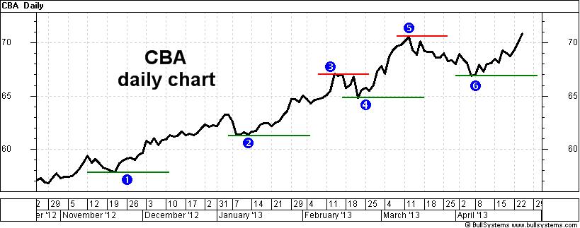
By way of example, the daily price chart below shows an uptrend for CBA
from November
2012
into April 2013. This uptrend is distinguished by a series of peaks and
troughs, but the alert observer will also see that between some of the
peak/trough pairs there is actually a sequence of lower peaks and
troughs (ie. a downtrend). This touchs on the topic of trends in multiple time frames
(which we can't stop to discuss here, but the link provides more
information for subscribing
Toolbox Members). However, do take a look
at the short horizontal lines on this chart. The green ones sitting
under the price action are potential levels
of support, and a good
place to set a Stop Loss level (see
more details about Stop Loss).
CBA and a series of Stop Loss levels
These Stop Loss levels are placed on the chart once we can see that a
clear trough has developed. If the price subsequently falls back to
this price level, and continues below the level, then we would sell.
For instance, near the start of this chart, the first horizontal line
and label "1" indicate a trough in the price at about $58 in November.
Going forward, if the price fell back to this level, we would sell. As
the price continued higher into January, and then fell back to about
$61 to form another trough, we would have scrapped our previous stop
loss level of $58, and adopted the level of about $61 as the new stop
loss level. And so we would continue as the price rose over time.
In this text we keep saying "a stop loss level of about...". It is
important to set your actual stop loss level a little under the last
trough in the price, because many less experienced investors will also
have a stop at a similar level. And when the price falls they will all
close their positions. But the short term trading desk professionals
all know this, and they know they will be able to pick some stock at
these levels, before the price continues to rise. Remember that once
all of the available supply is gone, the price will have to rise. So be
careful not to get caught out, and do have your stop loss a little
lower so as to be utilised with a genuine falling share price.
Initial Stop versus Trailing Stop
Just to clarify some terminology, the first Stop Loss line on the
simple example above would be consider the initial stop loss value,
and all the other stop loss levels at higher values in this price trend
are referred to as trailing
stop loss values.
|
|
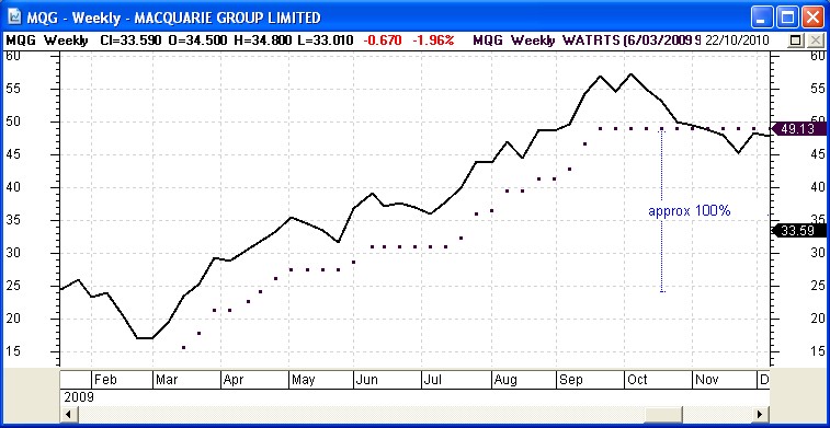
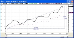
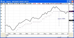
Trailing Stop using a chart indicator
Without
trying to explain too much about it here, the charts at
right are some more examples
of a Stop Loss (actually a Trailing Stop Loss).
In these examples,
the sequence of heavy dots that rises across the chart under the share
price is the stop loss value. The way to read it is that if the share
price in the next period falls to the level of the dot, then we should
sell. We can see in the second example that the price has fallen below
the dots towards the end of the chart so that a sell signal was given.
In both charts here, the row of dots running across and up the price
chart is the Wilson ATR Trailing Stop chart indicator (available in
BullCharts software and others). It is based on the Average True Range
(ATR) calculation, and does not fall on the chart. It is just one of
many chart indicators that are available for this purpose.
|
|
|
|
Step 5 - Consider other exit strategies
There are many ways to determine how to decide to exit a position. One
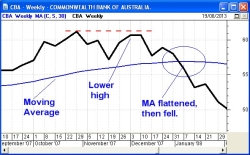
of these is shown in the sample chart at right.
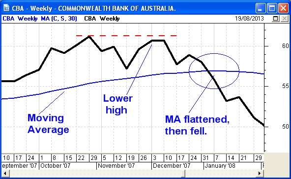
Sample at
right - The example chart at right shows CBA's weekly
share price in October to December 2007. On this chart a dotted
horizontal red line above the price action indicates a likely resistance
level
- a price above which no one is prepared to buy the stock at
this point
in time. The rising blue line across the chart is a Moving Average
(MA). The observations we can make are as follows:
- The
share price made a "peak" in the week of 29 October.
- Over the following weeks it failed to
move
higher than that peak, indicating a possible resistance level. The
price peaked in the two weeks commencing 3rd and 10th December , then
fell in the following weeks. This confirmed the Lower Peak (indicated
on this chart as "Lower high"), which confirmed the end of the uptrend
that had been in place.
- By early January the MA curve had flattened,
and the share price had fallen below the MA. According to Stan
Weinstein*, this is a classic sell signal
* - "Secrets for Profiting in Bull and Bear Markets", 1988, Stan
Weinstein.
See more information about Exit
Strategies.
|
|
|
Step 6 - Implement and action your exit strategy
Okay, so you have an exit strategy written down so that it is clear in
your mind. That is, when the specific condition that you have described
occurs, you can action your exit without a second thought. This is most
important. The first loss is always the smallest. Remember that we can
be profitable with a win to loss ratio of 4 to 6 (ie. 40 percent of
trades are winners), provided the losses are small and the wins are
large.
But, how do we know when the share price has triggered our exit
condition? If we are using a simple stop loss, and we have determined
that if the share price falls below a particular value, how do we know
when the share price actually falls to this level? We don't want to
spend all day watching the share price. Here are a couple of methods:
- For an End of Day (EOD) investor, the charting
software can be used to implement an alert, and then after you download
the latest EOD data the software can flag the stocks where a particular
price level has been triggered (eg. BullCharts
software can do this).
- If you would like a simple way to know as soon as a
share price has hit a particular level, then utilise the alert tools
that your online broker offers. For example, if CommSec is your online
broker, they have an alert service where you can easily set up an alert
so that if a share price hits a specific level, their system can send
you either an informational SMS message and/or an email.
There are many ways to make the final decision as to whether to exit
now, or wait for a second signal of some form. It is important to have
thought through the process and have it clear in your mind.
Summary
In the information above we have looked at some of the simpler ideas
regarding technical analysis, and some of the straight forward ways in
which we can utilise technical analysis. However, this is only the
beginning, and there is a lot more to technical analysis than what is
shown here. There is so much to this subject that a successful
technical analyst only needs to use a small amount of it. There is no
need to understand everything about the subject. The secret is to learn
just enough.
Good luck with your investing / trading, and watch out for the sharks
in the ocean.
More details...
For more information about breakouts, and more samples from which to
learn,
refer to the eBook
Articles in the Share Market
Toolbox - see the links at
top right.
|
More
Information
For more information on
technical analysis, refer initially to Brainy's pages on TA, and then
refer to the ATAA
web site, or the IFTA web site.
Robert writes information from time to time about
the market and investing. If you are not a
Toolbox Member, you
can
register to receive useful free information as it is published.
Privacy ensured, unsubscribe anytime.
See
the Testimonials - the things that people say about the
Toolbox and more.
|
Terminology
Any special terms that might be used in the text at left, can probably
be found discussed in the Toolbox somewhere. Perhaps
in Brainy's eBook Articles - see the Master
Index list for details. Or, search
the eBook Articles.
The
Share Market
- more information about the market and investing and trading.

The toolbox is an arsenal
of weapons to help you tackle the share market.
See a list of contents on
the Toolbox
Gateway page.
Robert
Brain provides support to both new and
experienced traders and investors.
Who
is Robert Brain?

And whatever you do,
beware of the sharks
in the ocean!
|